Heuristic Frameworks
Heuristic evaluation frameworks - your compass for navigating the dynamic realm of UX Design. Discover, apply, and evolve with these strategic guidelines to create compelling digital interfaces.
INTRO
In the dynamic realm of User Experience (UX) Design, heuristic evaluation frameworks serve as invaluable compasses to steer us towards the creation of more user-centric, efficient, and accessible digital interfaces. These heuristic principles are not one-size-fits-all rules, but rather strategic guidelines that allow us to scrutinize an interface from various perspectives, ranging from interaction patterns to cognitive load.
In this section of my portfolio, I have curated an assortment of key heuristic evaluation frameworks that I, and many other designers around the globe, have relied upon in our design journeys. These include:
Cognitive Workflow: This framework allows us to examine interfaces from the standpoint of cognitive psychology, addressing the mental processes users go through when interacting with our designs.
Jakob Nielsen's 10 Usability Heuristics: Pioneered by one of the godfathers of modern UX, these ten heuristics are a fundamental tool for any designer looking to maximize the usability of their interfaces.
Ben Shneiderman's Golden Rules: These rules, curated by a titan in the field of Human-Computer Interaction (HCI), offer guiding principles for designers to make user-friendly and engaging interfaces.
ISO's Interaction Principles: A comprehensive set of guidelines rooted in internationally recognized standards to ensure effective human-computer interaction.
The use of these heuristic frameworks, and the constant engagement with their principles, encourages a user-first approach to design. They serve as catalysts that spark design improvements, making digital interfaces not just visually appealing, but also functionally effective and gratifying to use.
COGNITIVE WORKFLOW
Will the customer realistically be trying to do this action?
This question finds problems with interfaces that make unrealistic assumptions about the level of knowledge or experience that users have. It also finds problems with systems where users expect to do a different action because of their experience with other interfaces or with life generally.
Is the control for the action visible?
This question identifies problems with hidden controls, like the gestural user interfaces required by an iPad where it's not always obvious what you can do. It also highlights issues with context-sensitive menus or controls buried too deep within a navigation system. If the control for the action is non-standard or unintuitive then it will identify those as well.
Is there a strong link between the control and the action?
This question highlights problems with ambiguous or jargon terms, or with other controls that look like a better choice. It also finds problems with actions that are physically difficult to execute, such as when you need to press three keys on the keyboard at the same time (and stand on one leg).
Is feedback appropriate?
This question helps you find problems when feedback is missing, or easy to miss, or too brief, poorly worded, inappropriate or ambiguous. For example, does the system prompt users to take the next step in the task?

NIELSEN'S 10 HEURISTICS

Visibility of system status
The system should always keep users informed about what is going on, through appropriate feedback within reasonable time.
Match between system and the real world
The system should speak the users' language, with words, phrases and concepts familiar to the user, rather than system-oriented terms. Follow real-world conventions, making information appear in a natural and logical order.
User control and freedom
Users often choose system functions by mistake and will need a clearly marked "emergency exit" to leave the unwanted state without having to go through an extended dialogue. Support undo and redo.
Consistency and standards
Users should not have to wonder whether different words, situations, or actions mean the same thing.
Error prevention
Even better than good error messages is a careful design which prevents a problem from occurring in the first place. Either eliminate error-prone conditions or check for them and present users with a confirmation option before they commit to the action.
Recognition rather than recall
Minimize the user's memory load by making objects, actions, and options visible. The user should not have to remember information from one part of the dialogue to another. Instructions for use of the system should be visible or easily retrievable whenever appropriate.
Flexibility and efficiency of use
Accelerators — unseen by the novice user — may often speed up the interaction for the expert user such that the system can cater to both inexperienced and experienced users. Allow users to tailor frequent actions.
Aesthetic and minimalist design
Dialogues should not contain information which is irrelevant or rarely needed. Every extra unit of information in a dialogue competes with the relevant units of information and diminishes their relative visibility.
Help users recognize, diagnose, and recover from errors
Error messages should be expressed in plain language (no codes), precisely indicate the problem, and constructively suggest a solution.
Help and documentation
Even though it is better if the system can be used without documentation, it may be necessary to provide help and documentation. Any such information should be easy to search, focused on the user's task, list concrete steps to be carried out, and not be too large.

SHNEIDERMAN’S GOLDEN RULES
Offer informative feedback
~ Design dialog to yield closure
Support internal locus of control
Strive for consistency
~ Permit easy reversal of actions
Offer simple error handling
Reduce short-term memory load
~ Enable frequent users to use shortcuts

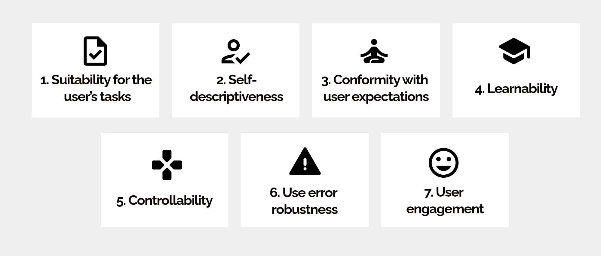
ISO’S DIALOGUE PRINCIPLES
Self-descriptiveness
~ Suitability for the task
Controllability
Conformity with user expectations
Error tolerance
~ Suitability for learning
Suitability for individualisation