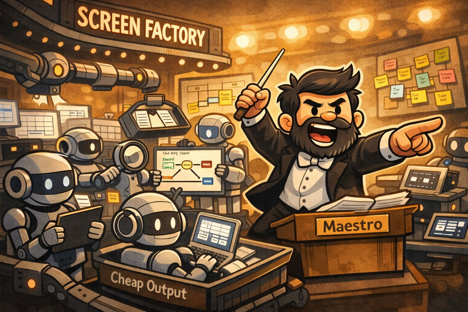
I already told you the operator got replaced and the orchestrator got promoted. Here's what the orchestrator actually does at their desk.
A team of five designers, all producing screens: that team can now ship the same flow with two designers and an agent pipeline. Better screens, fewer production bugs, time spent on decisions that used to get skipped. That outcome was the premise of the earlier posts. This one is the workflow that produces it; the method, not the prediction.
If you haven't read the setup pieces, start there; I'll reference them as we go. What follows assumes you already believe the why. It's the how.
The contractor story
A few years ago we inherited a design system from a contractor. The components existed. The naming was there. To someone glancing at a Figma file, it looked complete — the kind of thing you'd expect from someone paid to do the job right.
The problem surfaced slowly, over six months of actual use.
A button component that looked centred in Figma because the text lived inside a centred text frame. Except that text frame was set to "fit text", and the outer button frame was set to "left align". Visually centred in isolation. Off in use.
That's the diagnostic signal I've kept from it: state coverage, not visual coverage. When I audit a component now, I'm not looking at whether it looks right — I'm looking at whether its layer structure holds under the conditions it will actually meet. Is the outer frame's alignment consistent with the inner frame's autolayout? Are max-width and max-height defined, or is the component free to stretch until the viewport runs out? Does the nesting hierarchy survive without interpretation? That's the check. The contractor's button passed the "does it look right" pass and failed everywhere else.
There were dozens more. No size ceilings on buttons, so they'd grow indefinitely in a wide enough viewport. Components wired for the specific screens in the spec, brittle the moment you used them differently — in a dense list, inside a sidebar, stacked inside a card with variable content.
After six months, developers stopped trusting the library. They started building from first principles. The system that was supposed to make implementation cheap started making it expensive.
The contractor wasn't negligent. They'd optimised for the wrong deliverable — for how the system looked, not for what it needed to do. They'd designed the Figma file as if the Figma file were the destination. It wasn't.
Design is throwaway work. Say that in a room full of designers and watch the reactions. Some nod slowly, like they've thought it but never said it out loud. The claim isn't that design doesn't matter. The claim is that the Figma file is not the thing that matters. The code is the product. Once the code ships, the Figma file starts lying — not dramatically, just inevitably. That's the natural order, not a workflow failure.
The contractor had built precious scaffolding. Technically impressive, structurally unsound. And it's the same scaffolding an AI agent will produce at scale — every time, unless you've figured out what to tell it.

AI removed the wrong bottleneck
I went into this in Scope in the Age of Speed. The short version: slowness of production used to be a hidden forcing function (a constraint doing work we didn't realise it was doing). When it took two days to build a component, you thought carefully before you started. Scarcity of production time was secretly the scarcity that mattered.
AI removed that forcing function. Production got cheap. And the judgement work that used to be propped up by slowness — does this need to be a component at all, does this variant solve a real problem, is this constraint model right — got exposed. The prediction said AI would shrink design. It didn't. It made the thing slowness was protecting visible. Production was never the real constraint; thinking was.
AI removes the wrong bottleneck by default.
The rest of this post is the workflow I now use to put the thinking back in on purpose.
The new shape of the work
Five moves, in order. Each one is the answer to what slowness used to give us for free.
Context layers — load before you generate
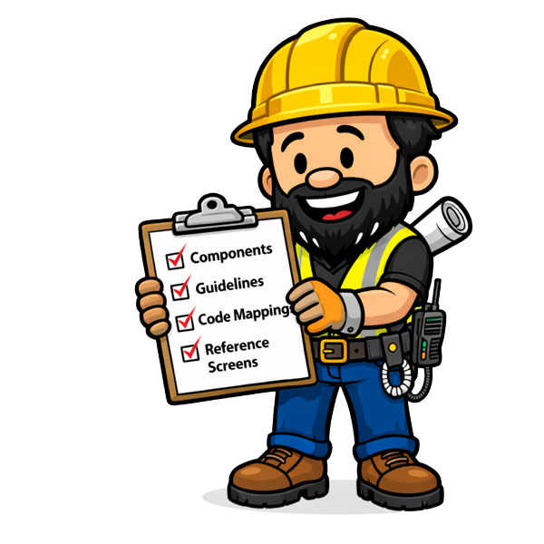
What it is. Before the agent touches a screen, I load four layers of context: components and variables (Figma), usage guidelines (Confluence), component-to-code mappings (Code Connect), and live reference screens from the product (or a competitor, or an adjacent flow).
Why it matters. An agent working from naming conventions alone is working from the abstract definition of "primary" and "secondary". It doesn't know what primary means for this product, this user, this context. With all four layers loaded, the agent carries philosophy, not just structure. That's the difference between technically correct component usage and philosophically correct usage.
Example. I ask Claude for a checkout confirmation screen. Without the layers, it gives me a competent generic confirmation. With the layers, it pulls the quiet visual register we've been using for post-action states, uses the existing ButtonConfirm variant (which Confluence says is for exactly this moment and nowhere else), and maps each component to its Code Connect counterpart. The first output is usable. The second is shippable.
Threshold. If you can't point to all four layers before a session, you're not in the workflow. You're doing a demo; output that looks good in isolation and doesn't compound across sessions.
Divergence before depth — six directions, not six shades
What it is. I ask Claude for six structurally different directions per screen. Different information architectures, different interaction models, different visual hierarchies. Not six variations on one idea. Six different ideas.
Why it matters. Divergence isn't iteration. This gets collapsed constantly, which is how divergence dies. Iteration is refinement within a committed direction. Divergence is mapping the solution space before committing. Most design processes skip straight to iteration and call it "rapid". The cost is that you never find out whether there was a structurally better answer you didn't consider.
Agents have a fixed attention budget; call it one hundred units. Ask for two screens, each gets fifty. Ask for a hundred, each gets one. In the production phase that's a problem. In the divergence phase it's the whole point. Thin breadth across six directions is exactly what you want, because you're not asking the agent to solve the problem. You're asking it to map it.
Example. The Crazy Eights exercise used to take an hour, a room, a facilitator, and PM negotiation. Most teams ran it once, at the start of a big project, and never again for the individual screens that needed it just as much. The designer's Crazy Eights exercise is now a prompt. The output is in Figma in the time it used to take to find an empty room. That changes which screens get the workshop — all of them, not just the heroes.
Threshold. If the six directions all look roughly equivalent to you — if you can't say within two minutes which is right and why — the problem isn't the directions. It's that you don't know what you're optimising for. Generating more directions won't fix that. Only intent fixes that. AI made divergence cheap. It didn't make judgement unnecessary. It made judgement the only thing that matters.
One screen at a time — the three-minute brief
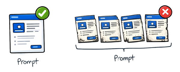
What it is. In the production phase I build one screen at a time, each with a full brief. Not "design screen three". "Design the checkout confirmation screen. The user has just completed a purchase on mobile, in a low-attention state. The key action is to give them confidence the transaction worked and a clear path forward. Here are the components we've established. Here's what screen two looked like. Maintain this constraint model."
Why it matters. That brief costs three minutes. It doubles the quality of the output. The alternative — just give me the twenty screens — blows through your attention budget at one unit per screen, and by screen fifteen the agent isn't designing. It's pattern-completing. Spacing that was precise on screen one is "close enough" by screen twelve. Components that were deliberate become approximated. The visual language drifts within the session.
Example. I tested this on a twenty-screen flow last month. Batched: every screen looked plausible, roughly three were genuinely right, the rest needed significant rework. One-at-a-time with a brief: every screen landed or got a specific redirect, total time was comparable, net output was shippable.
Threshold. If you're reviewing output and finding yourself saying "this looks fine" rather than "this is right", you've budget-diluted. Slow down. One screen, full brief.
Stress-testing — break before you ship

What it is. Every component candidate gets broken deliberately along four axes before it goes near a library: content, viewport, nesting, state. One word, two hundred words, empty, emoji, a URL that breaks a line. 320px, 1920px, narrow sidebar, full-page layout. Inside a card, inside a modal, inside a component that itself has constraints. Loading, error, empty, waiting, duplicated.
Why it matters. The contractor didn't run these tests. That's why the button looked right in preview and broke in use; nobody had tried to break it. Stress-testing is where you find the things that look right but aren't.
Example. Take the contractor's button back through the four axes. Content was fine at one word; at two hundred it stretched past the viewport because no max-width existed. Viewport was fine at 1920px; at 320px the label clipped. Nesting broke inside a sidebar whose width changed; the "left align" inner frame drifted further off-centre the wider the parent grew. State was the tell: the loading variant had been designed in isolation and inherited none of the parent's alignment rules. One axis would have caught it. Four caught it in under ten minutes. The rewrite: a proper constraint model with max-width, a centred inner frame bound to the outer, and the same rules applied to every state variant so they couldn't drift independently.
Threshold. Break before you ship. If you can't name the axis that would snap the component first, you haven't stress-tested it. You've admired it.
Pattern thresholds — 2 is coincidence, 6 is a candidate
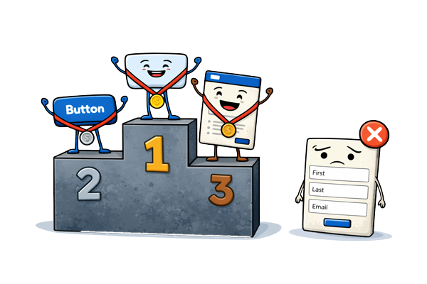
What it is. A promotion rule for when a shape becomes a component. Two is coincidence. Six is a candidate.
Why it matters. Promotion has a real cost; constraint model, variants, documentation, stress tests. Promote too early and the library fills with one-offs wearing component names. Promote too late and the same shape gets re-invented six times with six different paddings.
Example. A component that appears twice in a flow is a coincidence. A component that appears six times is a candidate — worth the cost of the constraint model, variants, documentation, and stress tests it'll take to promote it. The heuristic I use: if a designer who hasn't seen this flow could use this component correctly, it's worth promoting. If it only makes sense in the context of these specific screens, it stays a one-off.
Threshold. A component without a philosophy is a shape. Your system doesn't need more shapes; it needs more decisions. If you can't write one paragraph of why this component exists, when to use it, and when not to, don't promote it.
The orchestrator at work
Everything in the previous section is the shift from operator work to orchestrator work. Setting intent. Curating divergence. Stress-testing. Reviewing for drift. If you want the full frame for why that split happened, it's in The End of UX/UI Design. Here I want to name what the orchestrator actually catches.
An immune system doesn't produce cells. It monitors the body and identifies what doesn't belong. The trigger condition is specific; it detects a signature that's present but behaving wrong for its context. A cell that looks normal but isn't responding to the chemical signals the way a normal cell should. That's the immune response.

The orchestrator's trigger condition has the same shape. Four specific drift signals I watch for every session:
Visual coherence drift within a session. By screen eight, the agent is cohering the new screens against each other, not against the established system. Spacing that was token-bound is now hardcoded. The system's register is slipping.
Structurally coherent, intentionally wrong component choice. The accordion instead of a button. The component fires, the click works, but the interaction model is telling the user "reveal more" when they should be thinking "do this". Only a human who holds the intended user action can catch this.
Layer structure that looks clean but isn't implementable. Autolayout partially configured. Padding hardcoded because it worked in the specific preview. Nothing obvious at a glance; a developer discovers it two weeks later.
A pattern that looks like a decision but is actually a default. The agent reused a card not because cards are right here, but because it's seen cards in similar contexts. The repetition is habit, not logic. The tell: ask the agent why. If the answer is "similar contexts" rather than "this user's state", it's a default, not a decision.
When any of those trigger, I either pull the thread back with a specific rewrite brief, or I just take the keyboard back and do it myself. Which one depends on whether the drift is something the agent can fix or something the tooling can't reach. I bumped my head against this for a while before I accepted it; reprompting won't repair a tool limit. That's the job, and it's the right framing of agentic AI in design: the agent has authority over what its tools allow; the designer has authority over everything else, including knowing the difference.
Which is why the team composition changes. A team of five designers all primarily producing screens can ship the same flow with two designers and an agent pipeline — and ship it better, because the three designers who used to be in production have been reallocated: research with real users, usage guidelines, stress-testing the edge cases nobody previously had time to reach. In a setup I've been running recently: one senior owns intent and design system thinking across the flow; one mid-level runs the divergence and production loops with the agent; and a pipeline — Figma wired through MCP, Confluence docs the agent reads at session start, Code Connect mapping, Storybook for stress-test verification.
Before, six divergent directions took two days; now they take a morning. Before, a complete flow took a sprint; now it takes a week. (These are my own flows on my own stack — your mileage will vary with corpus, tooling, and team shape.) The rework column moves in the same direction: fewer developer queries about what a spec meant; fewer production bugs traced back to a component that broke at edge cases nobody tested. Less time making screens. More time making the screens right. Throughput on one side, rework on the other; they move together for the same reason.

That's the promotion the earlier post's title was pointing to. Not a title change. A change in what the job consists of.
What survived, and what I'm writing next

One thing didn't change through any of this.
The user is still a person. They have a cognitive state. They have a task. They encounter the product in the context of their life — the phone in the other hand, the child in the next room, the deadline at 4pm. Their experience is shaped by whether the design was honest.
AI can generate the screens. AI can implement the components. AI can map the code. AI can run the Storybook stories. AI cannot care about the user. It cannot hold the user's experience as the thing that matters. It cannot feel the friction in a poorly organised confirmation screen, or the confidence in a well-structured one.
The designer cares. That's the job. That's what survived.
Not every designer thrives in this. That's worth saying directly, without softening it. The designer whose advantage was speed — who could produce screens quickly, whose Figma skills were exceptional, who could churn through a brief faster than anyone else — that advantage is gone. The speed has been automated. The Figma proficiency has been automated. Those are real skills. They are no longer scarce.
Two posts come out of that, drafting now. The first — Design muscles atrophy too: building skill rehearsal into AI-era product teams — is about what you practice once the operator path gets pulled up; judgement develops through reps on specific moves, not on its own. Drafting now, ~2 weeks. The second — Operator → Orchestrator: the 2026 hiring rubric, portfolio signals, and career ladders — is the screening rubric, because Figma fluency and speed don't separate orchestrators from operators any more. Same window.
If you're early-career, this week
If you don't yet have a team or a usage guidelines doc to load into context, here's the smaller version you can run this week. Open a blank doc and write your own two-sentence intent before you prompt anything; that is where intent lives. Ask for six structurally different directions on whatever small brief is on your desk; pick one in two minutes and articulate why. Write a full brief for one screen, even if nobody asked for one. Take one component from your portfolio and break it along the four axes — content, viewport, nesting, state — before the end of the week. Orchestrator muscles don't develop by reading about them.
The work didn't shrink. It shifted. And the part of it that survived — the part that wasn't automatable and never will be — is the part I always wished I had more time for.
Now I do.