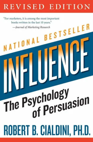
Have you ever wondered how subtle cues shape our decisions? Or how a simple change in appearance can alter perceptions? This is the 5th post reflecting on Robert Cialdini's seminal work, "Influence." The book explains how our minds work when making choices. I have read and reflected on it so that you get tips on how to use these concepts in design and work settings. Here, I combine three ideas from Cialdini's book with my own experiences. I show how these ideas affect communication, how we see things, and influence in work environments.
Designing with Authority
"From the first time I saw it, the most intriguing feature for me in the Robert Young Sanka commercial was its ability to use the influence of the authority principle without ever providing a real authority. The appearance of authority was enough. This tells us something important about unthinking reactions to authority figures. When in a click, whirr mode, we are often as vulnerable to the symbols of authority as to the substance."
This principle came to life for me in an unexpected way. One day I decided to dye my hair blue. It was a bold move. A few weeks later, I started interviewing for jobs, and having dyed my hair made me nervous and insecure. Yet, it turned out to be a revealing experience on perceptions of professionalism and creativity. Surprisingly, my interviewers saw the blue hair as a plus. When giving them the option to dye it back to black, they said it made me look creative, and gave me more of a "designer cred". This interaction taught me a lot about the power of symbols over substance. It showed how outward appearances can dramatically influence perceptions of authority and, in this case, creativity.

But what if there were more beyond using your looks as influence. What if your communication style also had an impact in your stakeholder relationships. As a matter of fact, it does. How we present our ideas greatly affects how they're received and their success. There is a counterpart to the blue hair analogy in the land of communication. This concept has made me value strategic communication more in work settings.
"By establishing their basic truthfulness on minor issues, the compliance professionals who use this ploy can then be more believable when stressing the important aspects of their argument."
Cialdini here suggests that to get people to trust you, you need to appear trust worthy. So "compliance professionals" will often tell you a number of agreeable truths in orther to convince you of their message.
Reflecting on this principle, I wondered its relevance within influence and communications in design.
- What if we could cushion the blow of negative feedback with positive updates? And
- What if we presented a design with known flaws to invite critique, only to refine it through feedback, steering it to our original vision?
Let me elaborate. Everyone has an opinion on design. Stakeholders especially so, and they should. However, stakeholder feedback is often raw, and requires processing before being actionable. Entering in arguments with stakeholders can be painful when relationships are new, and they are based on feedback only. By listening, and humouring stakeholders' ideas in minor things before disagreeing might pave the way to being able to pushback later on.
Additionally, you could manufacture evident "design oversights" for loud stakeholders to provide feedback on. Think of this as "sandboxing feedback" or "feedback damage control" before trust is established. Fixes to the design would naturally be aligned to your original vision of it.

This approach aims to foster an open-minded and collaborative environment. It's not deceitful but strategic. It helps nurture stakeholder collaboration early on. As someone with a strong technical background, I know that critiquing stakeholders' feedback can be tricky. It should be done in their language, not yours. Especially early on. Balancing your positive and negative communications can help your influence. This fosters a positive and collaborative atmosphere.
Another thing that influences collaboration, is your focus on yourself vs. the work. Take for example the quote below.
"Notice that much of his profit came from an apparent lack of concern for personal profit."
This insight became particularly poignant during an exchange with Leanne, during my time at TAFE SA. Leanne was my stakeholder and leader in another organisation in TAFE. When I joined TAFE I started suggesting changes 'From the UX perspective'. After suggesting several website changes, her team viewed me as inconsiderate. My response was fortuitous. I acknowledged their workload and left the decision to them. My message was clear: I had done my part by highlighting the issues and potential implications. Later on, Leanne hired me, and I joined a team that respected me and strong bonds with. All this happened because I cared more about the website, than my opinions being executed.
Conclusion
This post, based on personal stories and insights from "Influence," shows the intricate nature of design, communication, and influence. It reveals that in product design and work dynamics, success often depends on how well we communicate, influence, and work together. The principles of authority, truthfulness, and selflessness enrich our understanding of influence. They guide us to achieve innovative design results.
This exploration shows that the essence of design is not only visual. It lies in mastering organisational dynamics, communication, and fostering a spirit of collaboration. By leveraging these elements, you'll be able to drive innovation and shape the professional landscape. This will help you as a designer, haveing a profound impact on your professional practices and interactions.
Key Learnings
- Dare to be different: To enhance your image as an innovative thinker, don't shy away from making visible changes. These can serve as powerful signals of your creative authority and confidence, setting you apart in any professional setting.
- Steer Design Conversations: Introduce design elements in your projects to captivate your audience's attention and steer the design conversation with purpose, effectively leveraging the principle of authority to reinforce your influence.
- Embrace Selflessness: Prioritising the project over personal gain has proven essential in building trust and enabling collaboration. Focusing on business outcomes, over doing things your way, will impact positively your influence.

