UX Is Not Failing, Your Organisation Is
UX doesn't fail because designers lack skill. It fails because organisations are built to resist what UX actually does.
The business wants speed; UX demands pause. The business rewards output; UX optimises for coherence. The business measures progress by what shipped; UX measures it by whether the right thing shipped. Those forces are not naturally aligned. And yet we keep hiring UX into structures designed to override it, then wondering why outcomes don't improve.
That tension is not a people problem. It's a structural one. And it affects everyone involved: the leaders who set incentives, the hiring managers who write the job specs, the recruiters who screen candidates, and the designers who show up every day trying to do work the system isn't built to support.
Incentives, Not Intentions
Every function inside a company is optimised for something. The business is optimised for speed and return; it gets rewarded for shipping, for growth, for hitting targets within a quarter. Product sits in the middle, balancing ambition with delivery; it talks about vision but gets judged by output. Engineering is optimised for feasibility and efficiency. Marketing is optimised for acquisition.
And then there is UX. UX is optimised for coherence; for making sure that what gets built actually makes sense to the person using it. Not just once, but repeatedly, across an entire journey.
The problem is not that these goals are different. The problem is that only one of them consistently wins. When push comes to shove, speed beats coherence. Deadlines beat understanding. Output beats quality. Every time. So UX ends up in a strange position: brought in to improve decisions, but operating inside a system that rewards making them quickly, not making them well.
The evidence is remarkably consistent. Research is done, then ignored. Designs are explored, then overridden. Insights are acknowledged, then deprioritised. Not because people are malicious, but because something else always takes precedence; a deadline, a stakeholder opinion, a quarterly target, a feature that "needs to go out."
Over time, this produces an illusion. Designers keep producing. Teams keep shipping. The company keeps saying it values UX. The artefacts exist; the wireframes, the flows, the prototyped screens. So leadership genuinely believes UX is working. But the outcomes don't improve in any meaningful way. More screens, more features, more activity; not necessarily better decisions. The company believes it has UX because the artefacts exist. But UX was never about artefacts — it was supposed to change how decisions are made.
That is the conflict. Not personality. Not capability. Incentives.
Agile, Lean, Sprints, Now AI
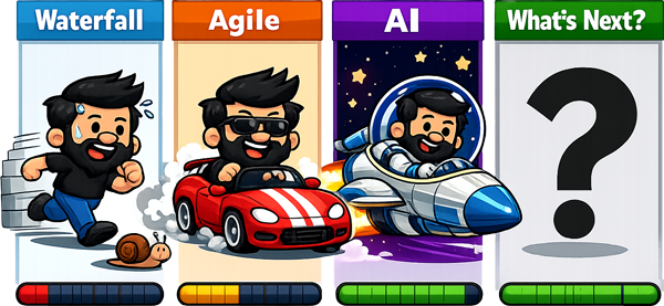
This structural tension is not new. It just keeps finding new accelerants.
Agile compressed discovery; what once took weeks of upfront research got squeezed into a sprint zero that nobody revisited. Lean compressed validation; "just ship an MVP" became a permanent excuse to skip understanding the problem. Sprints compressed iteration; two-week cycles rewarded velocity, not reflection. Each time, UX either adapted or got sidelined. Usually both.
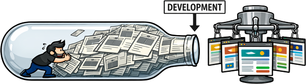
AI is the current chapter of that same pattern. It compresses craft. The one thing businesses already overvalued (output) has become almost free. Need more screens? Done. More variants? Done. More flows, more ideas, more iterations? All done in minutes.
So companies double down on what they already believed: more design equals more value. But that was never true. AI just made the fallacy cheaper to commit. You don't get better products; you get faster confusion. More polished inconsistency. Feature bloat at scale.
AI didn't change the role of UX. It exposed the fact that the real problem was never production. It was decision-making all along.
And that insight will still hold when the next speed-optimising force arrives; because one always does.
Beyond Artefacts
Most companies still think UX is about screens. Wireframes. Flows. UI. Polish. And to be fair, that is what UX often ends up doing. But that is not what UX is for.
UX connects business intent to user reality. It is the function that holds together what the business wants, what technology allows, and what the person using it actually needs; not in isolation, but as a system.
A good UX practice reduces ambiguity. It aligns teams. It makes trade-offs visible. It forces clarity where there was assumption. That is why it feels uncomfortable; because real UX challenges momentum, questions direction, and exposes the gap between what an organisation says it is building and what it is actually delivering.
The moment UX is reduced to execution, it loses its real leverage. Because that leverage was never in the artefacts. It was in shaping the decision before the artefact ever existed.
Your Role in This
If this tension is structural, then everyone involved has a role to play. Not just UX.
Hiring Managers
If you are not willing to change how decisions are made, don't hire UX. Seriously. UX is not a service layer that makes things look better after the fact. It exists to shape direction, challenge assumptions, and slow things down when slowing down is the right call. If your organisation rewards speed over clarity and opinions over evidence, you won't get better outcomes. You'll just get nicer-looking ones.
Signals to Look For Portfolio reviews and interviews tend to reward polished deliverables. If you want to spot orchestrators, shift what you ask for:
|
Recruiters
Stop screening for screens. Portfolios full of polished UI tell you very little about how someone thinks, how they make decisions, or how they influence outcomes. Start looking for how candidates structure problems, how they handle ambiguity, how they use evidence, how they navigate trade-offs. In this environment, execution is no longer the differentiator. Thinking is.
UX Leadership
Your job is not to produce better artefacts. Your job is to install a system; one where decisions are informed, insights flow, trade-offs are visible, and teams are aligned. If your team is stuck producing endless variants, documenting every edge case, or functioning as a wireframe factory, the problem is not capacity. It's direction. And that is yours to fix.
Mentees and Designers
Focus less on output, more on taste. And taste is not something you're born with; it's something you build through consistent, deliberate repetition.
Here is a real example. I wanted to get better at dialling in my coffee grinder (a Breville Dual Boiler, if you're curious). So I started asking ChatGPT for one small tweak at a time; adjust the grind two notches finer, change the brewing temperature, pull the shot one second shorter. Each morning was a single iteration. Over weeks, the feedback loop tightened; I started noticing what each variable actually changed. Eventually, dialling in became second nature. Then I built BrewGPT and published it on the App Store. Three months of small reps, reflection, and system-building turned into something I could ship.
(If you're curious, here's the case study of my journey:)

The same loop applies to design. You don't develop taste by consuming tutorials. You develop it by doing the work, reflecting on what happened, adjusting one variable at a time, and shipping the result. Anyone can produce screens now. Not everyone can guide a team toward the right outcome.
Start Here
|
Self-Check Friday afternoon, five minutes. Ask yourself these before you close your laptop:
No judgement if the answers are all "no" this week. The point is noticing the pattern over time. |
Club+ — What Broke the Deadlock
When I started working on Club+, the core idea was simple: a place to store all your bills. On paper, it sounded reasonable. Everything in one place; inspired by tools like AirHint.com that aggregate financial information and let you act on it.
In practice, it was a dead end.
You could upload your bills, but you couldn't do anything with them. No comparison. No switching. No next step. Just a dashboard full of documents sitting there, doing nothing. You'd land on the screen, and then what? Scroll? Explore? There was no answer, because no one had designed one.
That absence was the problem. No clear next action meant no habit loop. No habit loop meant no retention. And the data confirmed it; retention had flatlined for years. People signed up, poked around, and quietly disappeared.
The CEO at the time defended the document-store vision. He believed in "all your bills in one place" as a proposition, and no one in the room was willing to challenge him on it. I was. Not because I enjoyed the friction, but because the evidence was sitting right in front of us and we were choosing not to look at it.
The proposal I kept pushing was simple. Don't focus on all bills. Focus on the ones we can actually act on. Electricity. Gas. Insurance. Things where the user can do something meaningful: compare, switch, improve. Then redesign the entire experience around a single question: what can the user do right now?
Not "what can we show?" Not "what can we store?" What can the user do right now?
AirHint.com became the reference point that gave the team a concrete alternative. It wasn't abstract anymore; there was a real product doing exactly this, and doing it well. Once the contrast became undeniable — this version lets you act, this one doesn't — the decision stopped being subjective. There was nothing left to argue.
The impact didn't come from producing better screens. It came from making the right decision impossible to ignore. After the redesign, retention trended up for the first time in years. Adoption appeared. Recurring use appeared. Not because the pixels were better, but because the experience finally gave people a reason to come back.
Operators vs Orchestrators
There are two modes designers operate in, and the distinction matters more now than it ever has.
Operators execute. They take a brief, generate screens, explore variations, respond to feedback, and move things forward. Reliable. Efficient. And increasingly replaceable; AI can generate variations faster than any human, fill in states, explore edge cases, and produce polished outputs in seconds. If your value is tied to production, you are competing with something that doesn't get tired.
Orchestrators work differently. They don't start with screens. They start with direction. They define the problem, structure the thinking, connect dots between teams, and shape how decisions get made before anything is produced. They build the system that operators — and now AI — execute within.
So what does an orchestrator actually do on a Tuesday morning? They review experiment decision criteria. They prep a stakeholder alignment session. They audit whether last sprint's shipped feature matches the intended experience. Not pushing pixels.
One of my direct reports built a decision-making system for CRO experimentation. It determines when to run experiments based on minimum detectable effect versus expected volume of actions. A 2% needle-move can take forever to reach statistical significance; a 15% shift can be done and dusted within a week. But he didn't stop at building the system. He created a case study about how to communicate it, how to onboard people across the business into the methodology. That's orchestration. Not just solving the problem; shaping how the organisation thinks about the problem.
The tension shows up when companies say they want orchestrators but incentivise operator behaviour. My current boss wants more wireframes and simultaneously argues that AI should automate pixel-pushing — except no vetted AI design tools exist in the company. So design risks becoming busy work: high wireframe volume with little impact, because the dev pipeline can only implement a fraction of what gets produced. Words and incentives pointing in opposite directions. When that happens, orchestrators need to redefine the playing field entirely; in this case, shifting the team toward service design, which isn't as easily automated and delivers higher strategic value.
AI is replacing operators. It is amplifying orchestrators. The designers who understand this are already moving — not away from design, but upstream.
Making the Wrong Decision Obvious
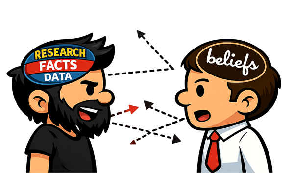
Being right is not enough. You have to make the right answer visible to a room full of people who may not want to see it.
The technique is simpler than most designers expect. You shift the conversation away from opinions and into reality. Bring the user into the room — not as a persona, not as a slide, but as a situation. "Imagine you land here. What do you do next?" Then wait. Most of the time, there is no good answer. That's where clarity starts.
From there, you layer in evidence. Data. Research. Observed behaviour. Not to overwhelm the room, but to remove wiggle space. Now it's no longer "I think this is better." It's "We know users behave like this. We know this creates friction. We know this path leads nowhere."
The goal is not to win arguments. The goal is to make the wrong decision feel obvious. Once that happens, persuasion is no longer necessary. The decision makes itself.
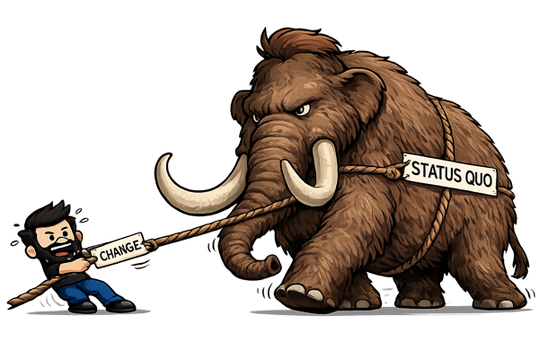
The Choice
Every time a decision is made for speed over clarity, for output over coherence, you add a little more friction into the system. These small misalignments compound. And over time, that friction becomes the experience.
So if you are not ready to commit to UX, don't hire it. Partial UX is worse than no UX. It creates the illusion you are doing the right thing while quietly reinforcing the same broken decisions underneath. You get the artefacts, the language, the process on paper — and none of it changes how the company actually operates.
UX will challenge you. It will slow you down. It will force you to confront things that are inconvenient, uncomfortable, or simply harder than pushing the next feature out the door. If that's not something you're willing to embrace, then no amount of AI, no amount of design talent, and no amount of process will fix a system that refuses to make better decisions.
UX doesn't fail because designers are weak. It fails because the organisation is not ready to change. The question is whether yours is.