Conversion Rate Optimisation
Discover the UX overhaul that boosted CarExpert's conversions by 18.88%—a strategic leap in automotive digital innovation.
OVERVIEW
Discover the UX overhaul that boosted CarExpert's conversions by 18.88%—a strategic leap in automotive digital innovation.
01
The Outcome
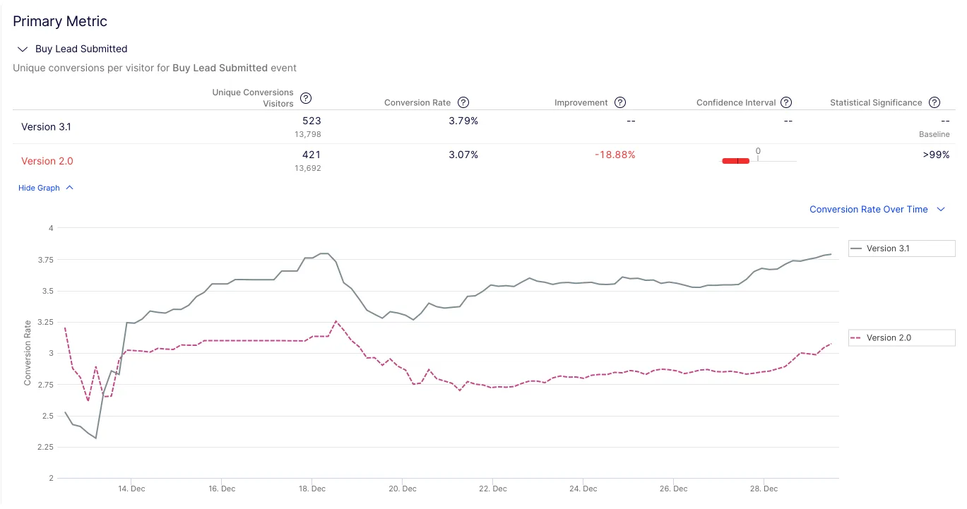
In the revamp of our buy landing page from version 2.0 to 3.1, we achieved a notable uplift in key metrics, marking a triumph in both user experience and business impact. Our conversion rate increased from 3.07% to 3.79%, translating to nearly 6,000 conversions at $80 each, which significantly bolstered our revenue. This 18.88% rise in conversions underlines the effectiveness of our user-centric design approach in driving tangible business results. Additionally, enhanced engagement metrics, such as increased time on page and higher dealer inquiry click-through rates, coupled with a reduced bounce rate, further validate the design's alignment with user needs, proving its effectiveness in facilitating a more compelling and relevant car-buying journey for our users.
The Process
1. Understanding the Challenge
At CarExpert, we've established a steadfast reputation for editorial integrity, setting us apart in the digital arena. Yet, as we shifted towards a content-based marketplace, the competition intensified, especially against seasoned players like Carsguide and Carsales. Despite our journalistic acclaim, our presence as a trustworthy new-car sales platform needed reinforcement.
Leading the charge to enhance our 'buy page' from its original form, I harnessed variant and pricing data previously dispersed across our site to create a cohesive user experience. This initial leap was a vital step in demonstrating the power of UX design as an integral voice within our business strategy.
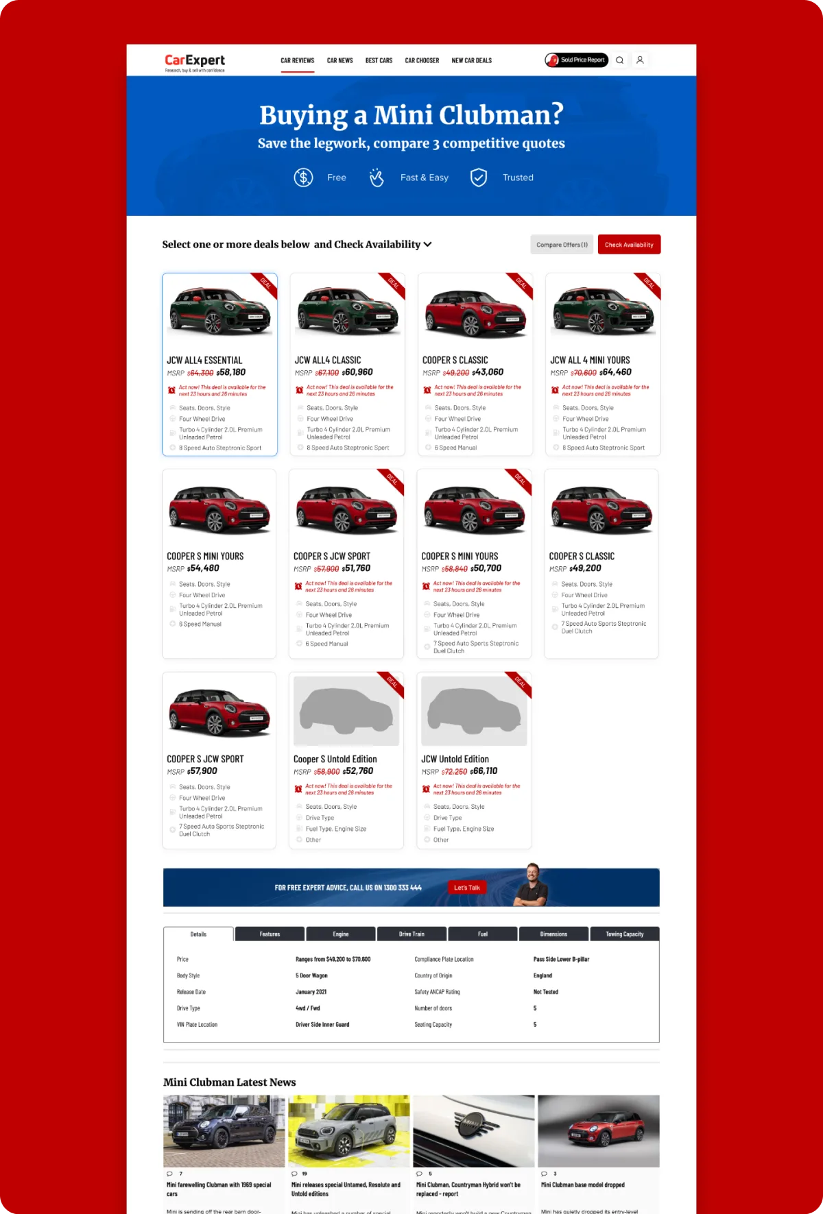
The narrative took a twist when a founder, leveraging SEO acumen and bold sales tactics, altered the buy page without design or UX guidance. The result was a 'Frankenstein' version—unwieldy and devoid of design oversight, leading to diminished clarity and performance.
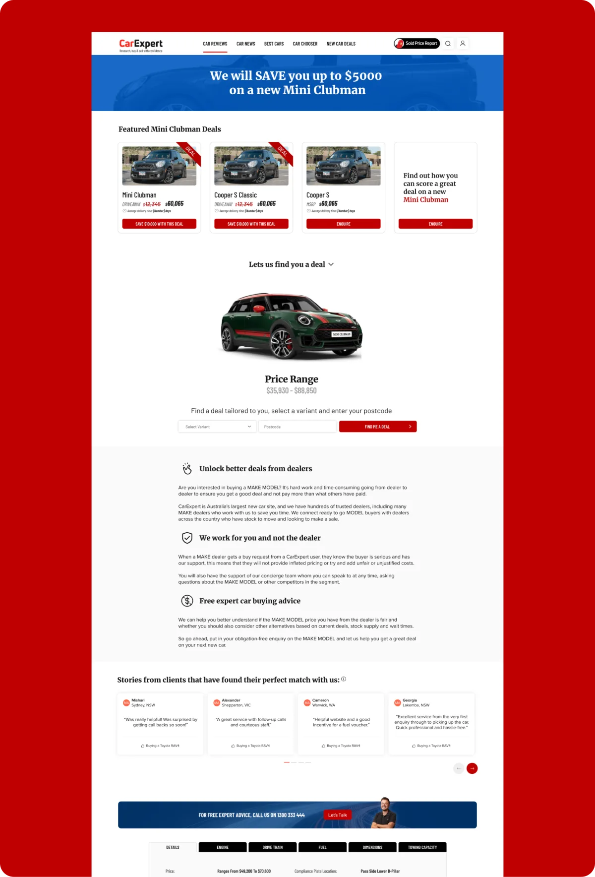
In this high-stakes environment, direct confrontation was not an option. Instead, I engaged in strategic dialogue with my CPO, underlining the lost narrative and slipping performance. My steadfast advocacy for design and UX principles aimed to realign our marketplace strategy with the user experience at its core.
2. Research and Discovery
Our startup's dynamic, led by visionary leaders, initially placed less emphasis on user research—a direction I was eager to shift. Leveraging insights from a previous strategic design case study, which gave us a solid market understanding, I aimed to incorporate these learnings into our process.
I took the initiative to lead our UX efforts using a tried-and-tested tool, the Product Design Canvas. I orchestrated a cross-functional workshop, drawing in expertise from marketing to development, ensuring a comprehensive approach to product design. Pre-workshop, I tasked team members to seek inspiration from leading industry platforms, such as Compare the Market, Edmunds, and AutoTrader, while also reflecting on our own initial versions and the innovative aspects of carwow. We dissected top-level feedback, transforming it into a focused, actionable plan. The workshop's mission was straightforward: establish our goal, define our audience, and craft our design principles.
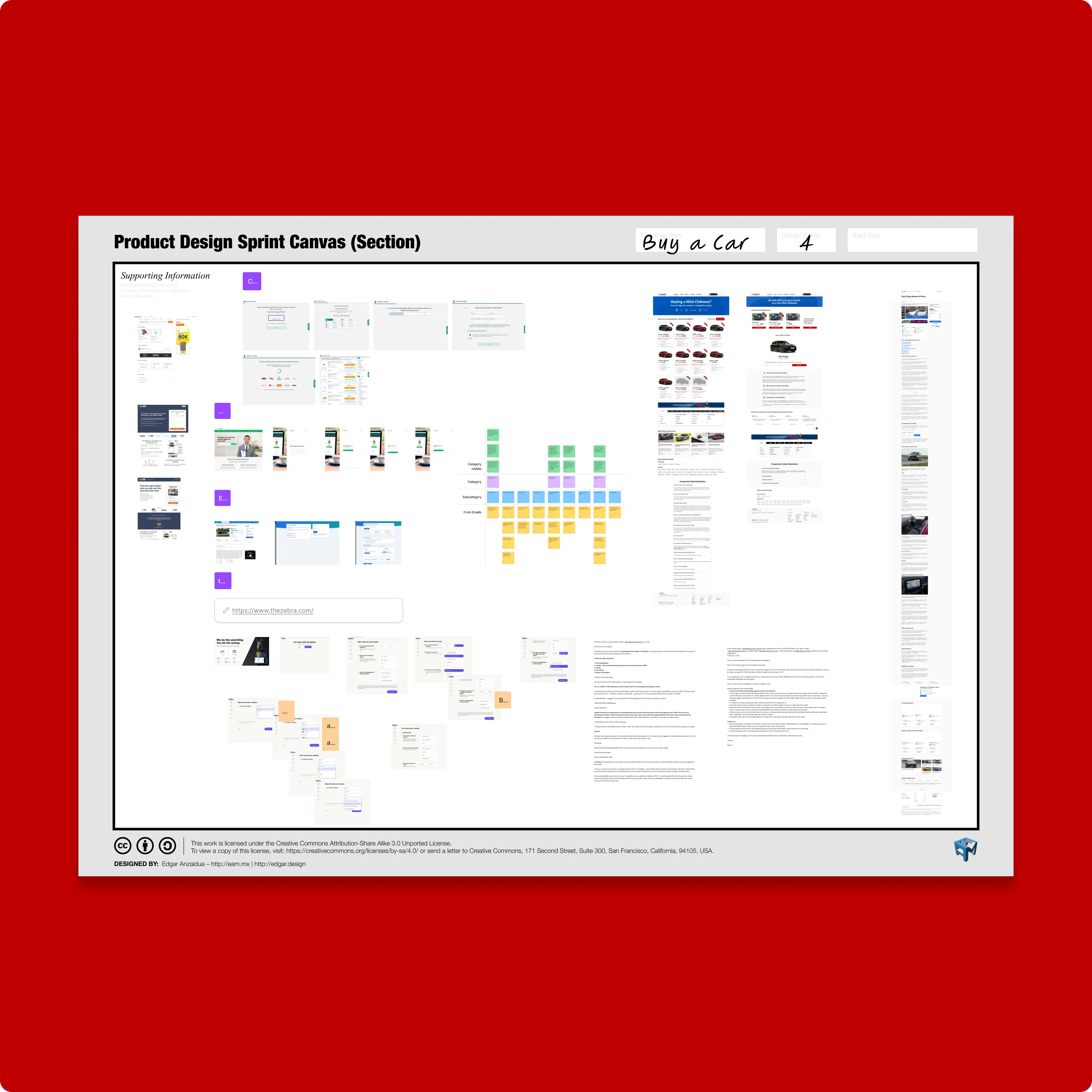
The pressure was tangible—between the CEO, Founder, and the Product Team, there was no room for a protracted process. We streamlined our approach, bypassing some steps to propel into a hands-on design phase.
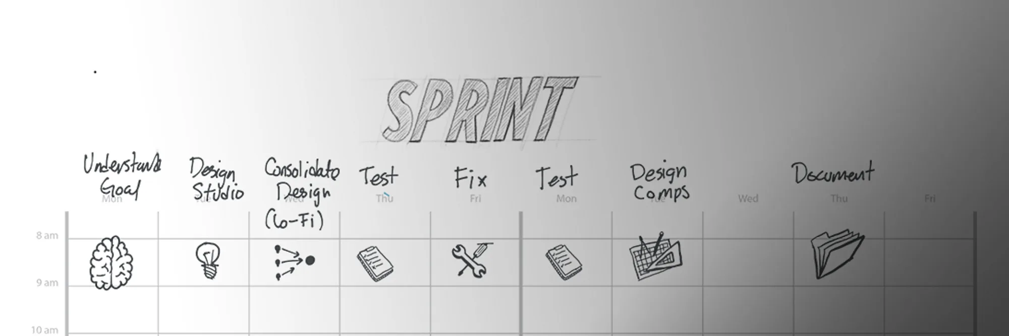
In the design studio session, ideas flourished as each team member contributed perspectives within our shared context.
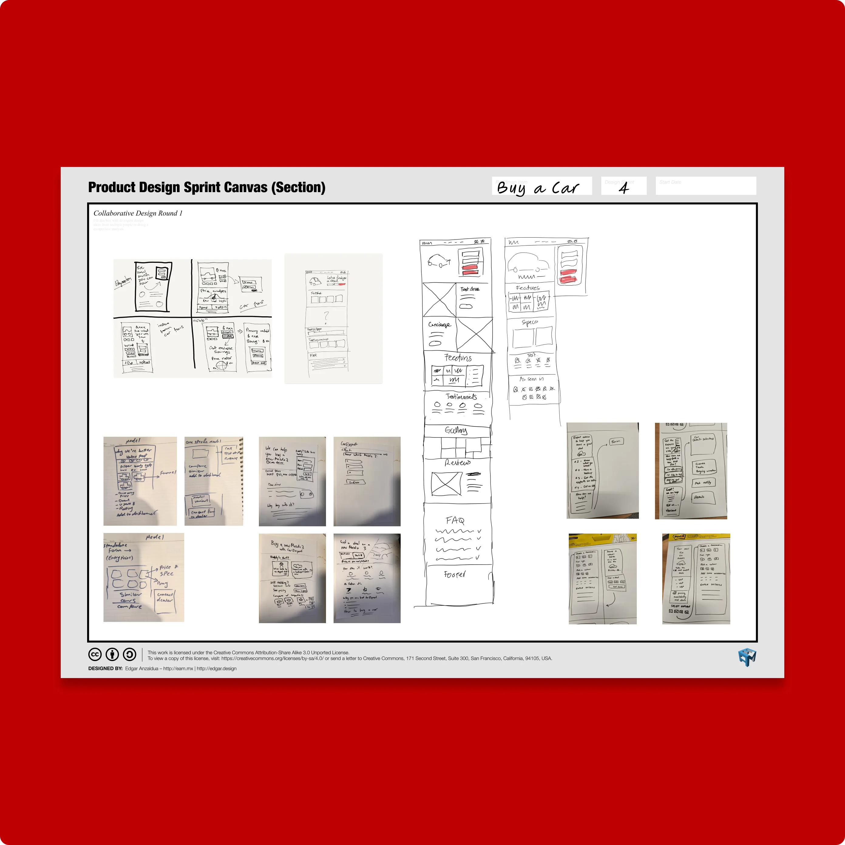
Post-ideation, we embraced a culture of sharing and iteration, where 'borrowing' concepts was encouraged to refine our designs further.
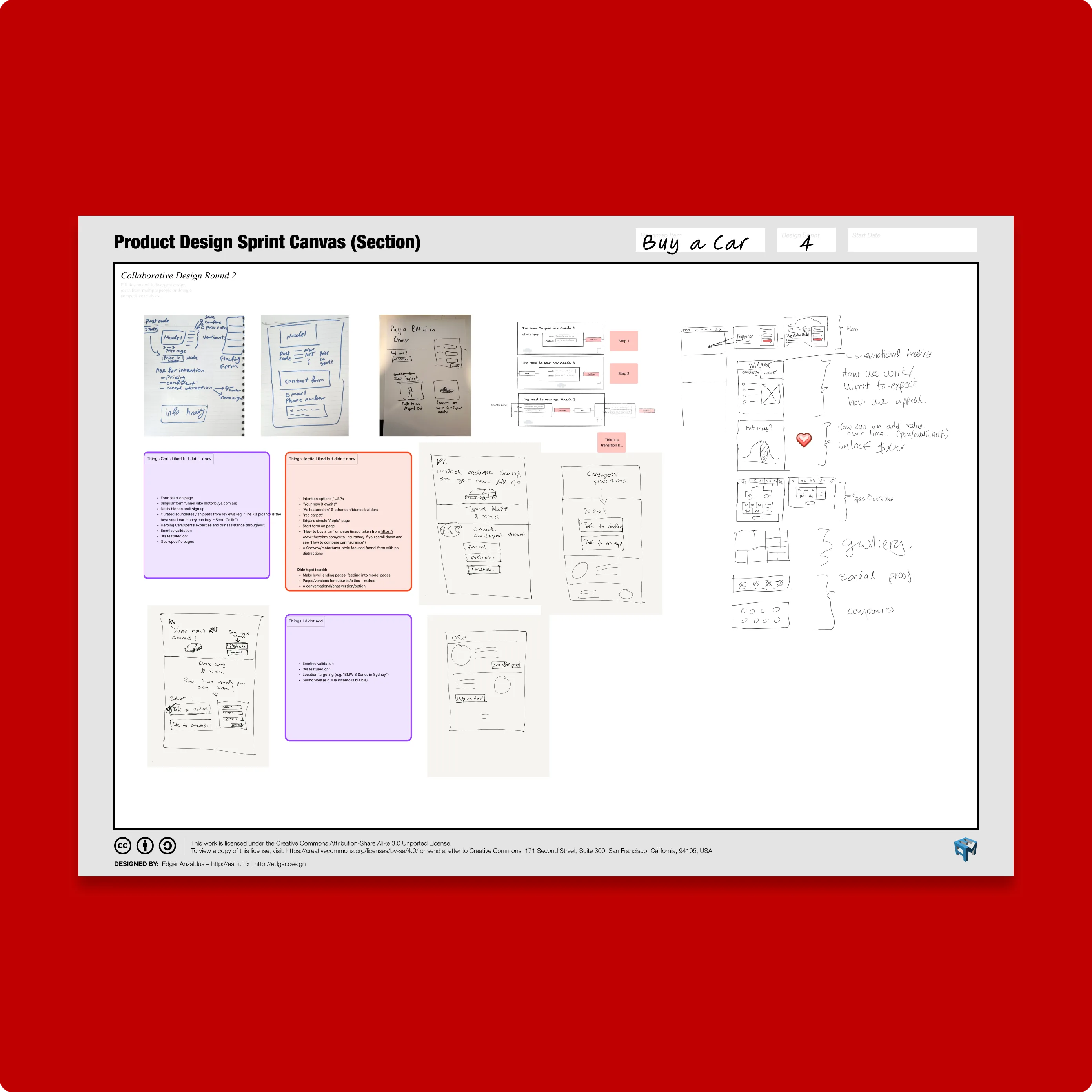
This rich collaboration led us to a critical juncture, presenting two distinct design directions for us to deliberate.
3. Design and Implementation
Navigating the fusion of two distinct design philosophies presented a unique challenge. We had two paths: one, a conventional car-centric page, optimized to capture attention with targeted keywords like "buy Toyota RAV4." Its goal was to forge an immediate emotional bond with the vehicle, enticing users towards a purchase inquiry with our dealers.
The alternative was a bold reinvention, rooted in a user experience-centric philosophy. This design was an embodiment of CarExpert's vision, articulating our commitment to guiding customers through their car-buying journey with a less is more approach at the page's forefront. It cut through the standard specifications and galleries to focus on the essence of our service: connecting buyers with our dealer network for the best deals and a streamlined buying process.
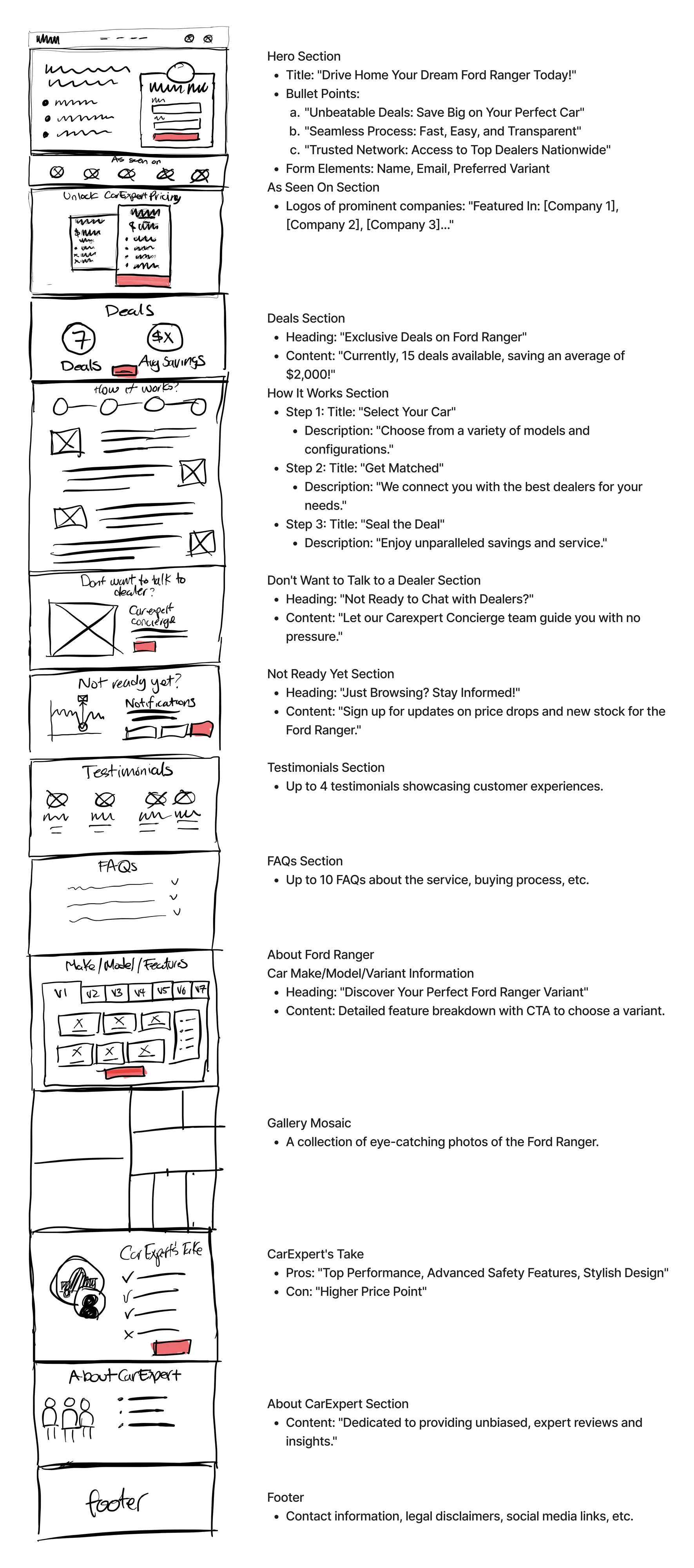
Our design narrative commenced with low-fidelity wireframes, each stroke and annotation serving to communicate the underlying concept.
Progressing to mid-fidelity wireframes in Figma, we employed placeholder elements to outline the structure, intentionally left raw to draw decision-makers into the story rather than the aesthetics.
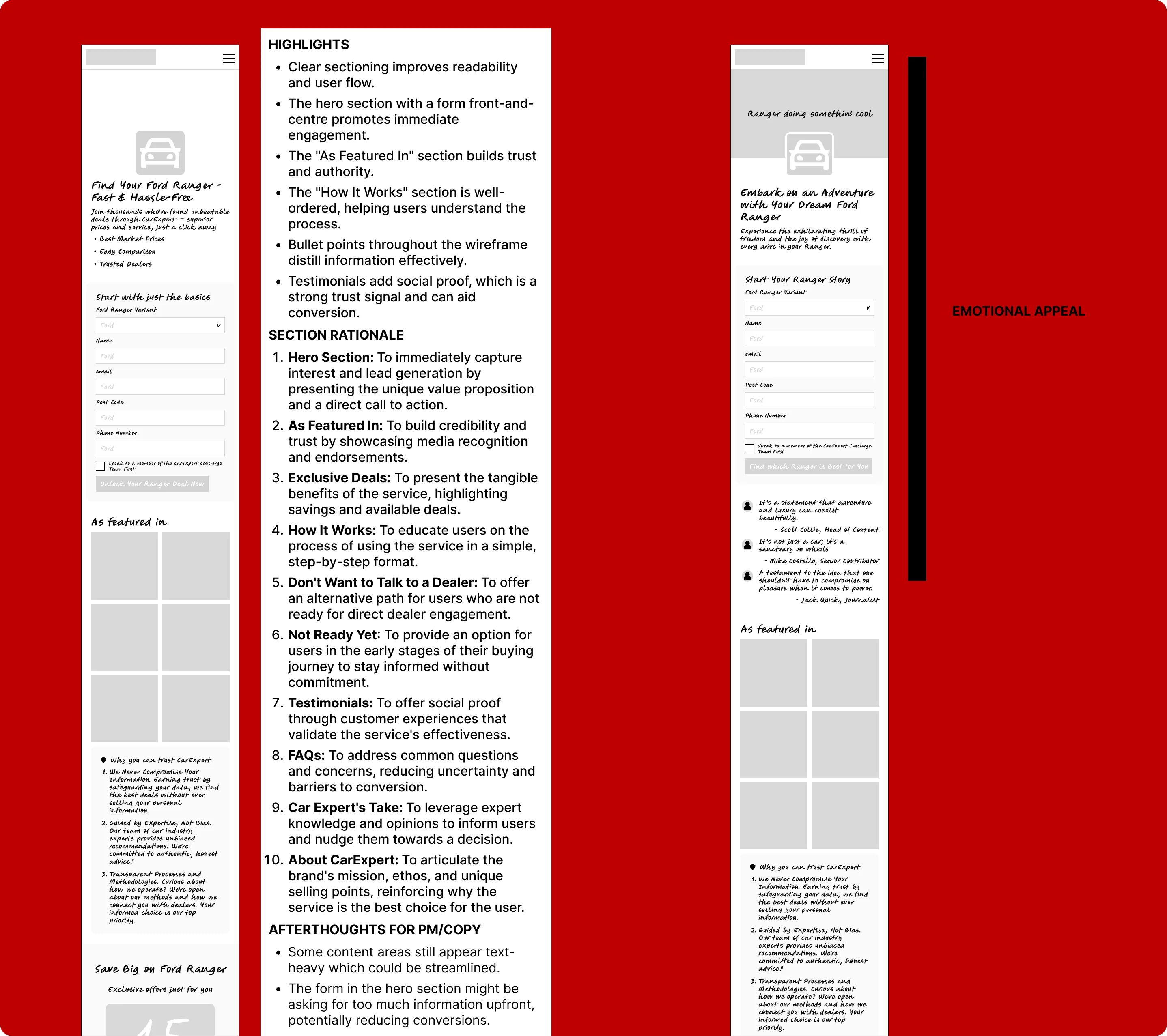
This innovative path of the CarExpert-centric option, while a stark deviation from our historical approach, struck a chord with the team during reviews. We chose to advance with this UX-driven concept, parking the traditional model for potential future use.
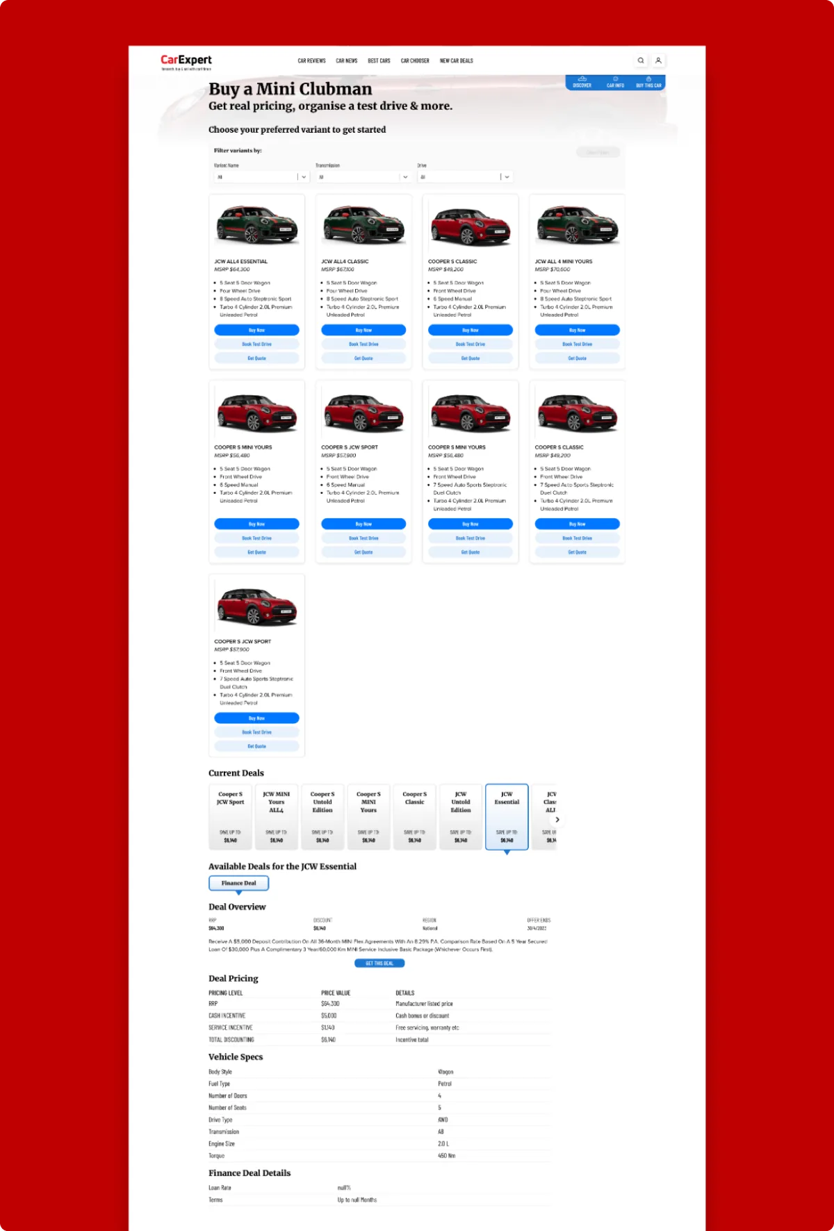
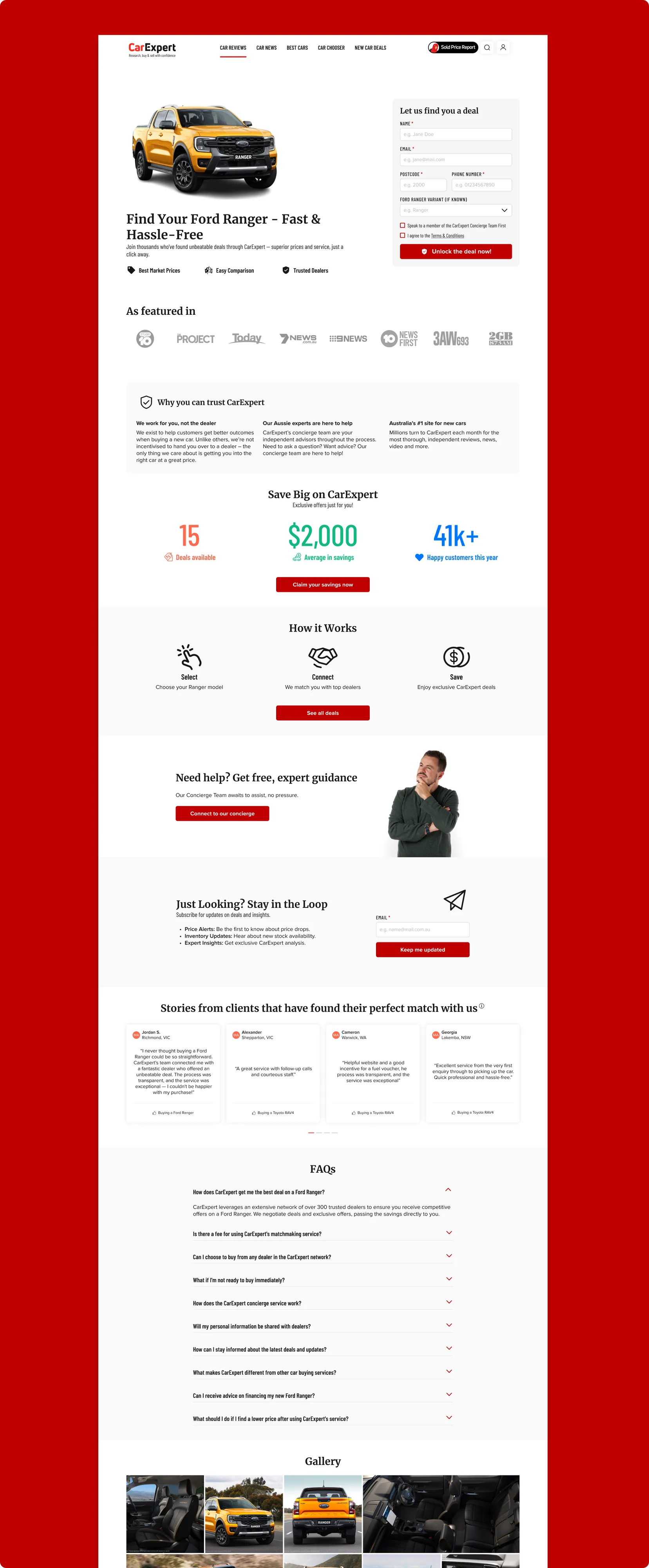
The culmination of our process was the creation of high-fidelity wireframes in Figma, showcasing a comprehensive design language.
The result was compelling—a minimalist yet impactful design that clearly communicated our unique value proposition of facilitating connections between buyers and sellers. This stood in stark contrast to the industry's standard, which often revolves around the illusion of the sale rather than the buyer's journey.
Upon launching this redesigned landing page through an A/B test lasting a month, the data spoke volumes, affirming the superiority of our new strategy.
Key Learnings
The recent redesign has exceeded our benchmarks at CarExpert, delivering not just in metrics but also in redefining our narrative. As a UX leader, I've learned that the real triumph is in the journey, not just the outcome. The numbers tell a story of success, but it's the philosophy behind them—the commitment to integrity and user-centricity—that truly shapes the results. This project has reinforced the notion that while industry trends may lean heavily on conversion rates, the strategic and transparent path to those numbers is equally important.
In my pivotal position within the product team, I've made it my mission to champion the user's voice, ensuring that it guides our design choices. We're dedicated to continuous improvement, utilizing user feedback to fine-tune our CarExpert-centric design and boost conversions even further.
Now, as we prepare to launch Option 1, the car-centric version, for comparative analysis, I remain dedicated to CarExpert's best interests. Should this option prove more effective, I'm poised to blend the best of both worlds, merging the strengths of both options to elevate our user experience.
My stance on transparency in design is resolute. Users should never feel misled when interacting with our platform. This belief isn't just a personal mantra; it's a professional mandate. It's my goal to lead by example, advocating for clear, honest UX practices that respect our users as much as we respect ourselves. If our methods don't stand up to the light of transparency, then it's not just our design that needs scrutiny—it's our entire business philosophy. We're not just designing pages; we're setting standards for the industry, advocating for a future where transparency is not the exception, but the norm.
Edgar held the role of Head of Product Design at CarExpert between 2023 – 2024 in Sydney, NSW.
RELATED CASE STUDIES
