Product Design Spec Canvas
Discover the Change Spec Canvas, your interactive design guide for creating high-impact, user-friendly products. Ready to reduce your documentation effort and boost shared understanding? Step this way.
PRODUCT DESIGN SPEC

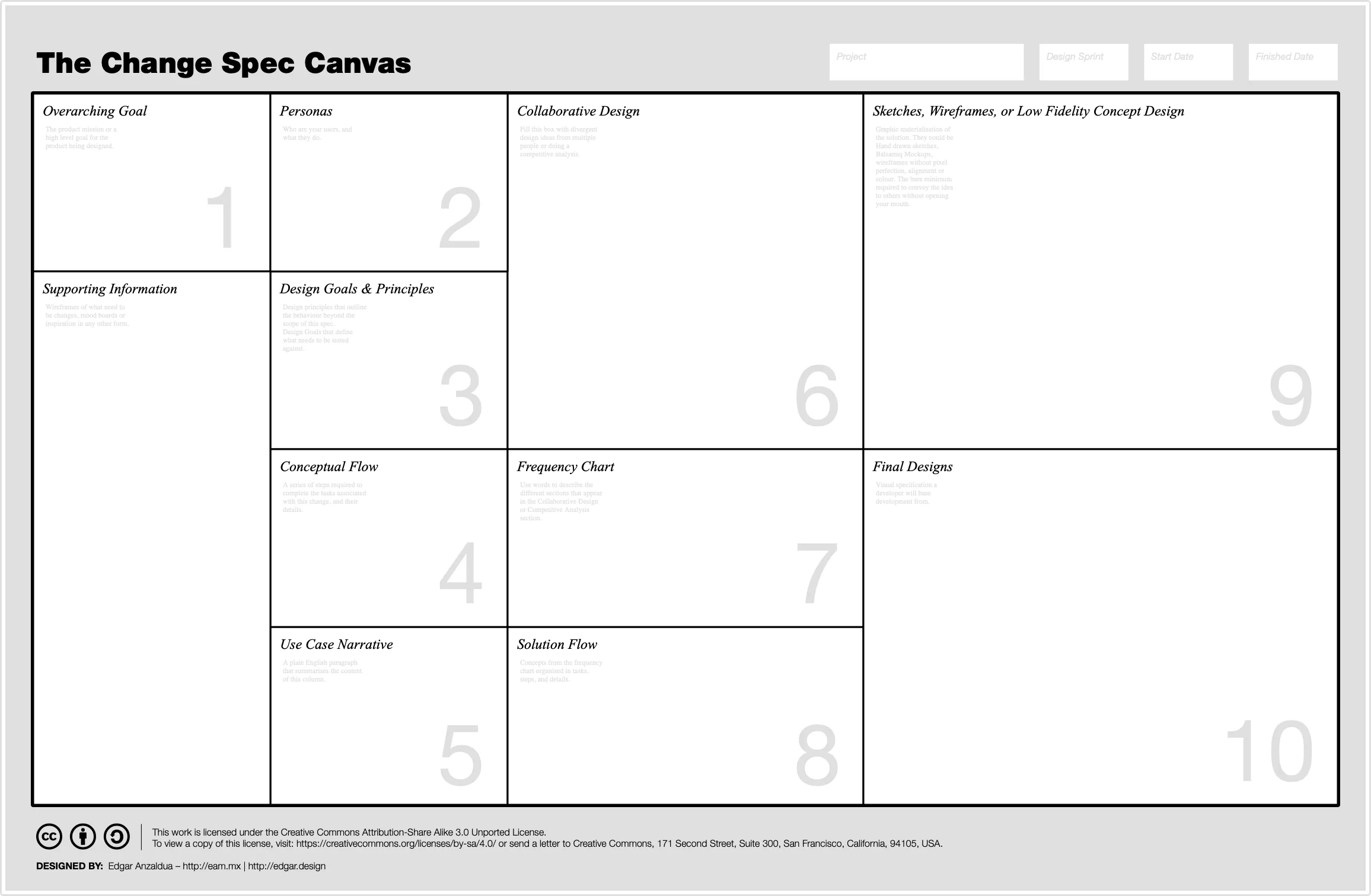
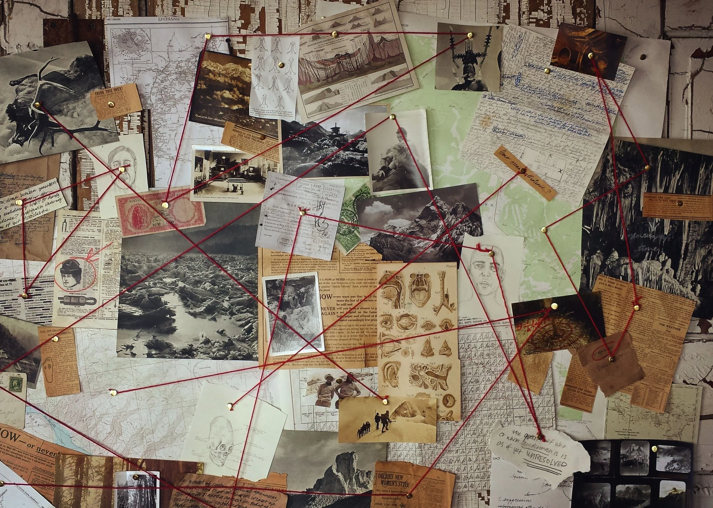
As I describe it in Product Design Sprints (Scrum) The Change Spec Canvas is going to make you feel like a detective using his/her hotel room to trace a dangerous criminal, with the difference that you are not a detective, but a designer, it is not a hotel room, but a digital board like Mural and you are not chasing a dangerous criminal, but trying to create great, user-centric products.

The Change Spec Canvas is a board, the likes of the Business Model Canvas or the Lean UX Canvas. If you aren't familiar with them, check out the following links.
This board is to be used in conjunction with Sy and Miller's Staggered Sprints approach to document the flow of the design scrum, or small-contained features in kanban or waterfall environments.
They are great from communicating product design rationale between Design, Research Product Management and Development teams, and they will reduce amount of work you put into documentation while increasing the shared understanding at the same time.
For example, when I worked in Carsguide / Autotrader (Kanban) or Canon (Scrum) we used to create boards like this one to move from ambiguity to specification.
Check out these two projects:
Although the canvas didn't exist back then, the layout of both projects digitally remain consistent.
The canvas is divided in 10 different boxes.
OVERARCHING GOAL
Products tend to extend multiple sprints or design cycles. This box should contain the mission or a high level goal for the product being designed, and should ideally remain consistent between different boards. For example, if you use 12 different boards for a project that spans 12 different sprints, then this box will remain the same between them.
PERSONAS OR AUDIENCE
This box should include information about your users. Who they are, and what they do. Bringing the information as close to the scope of a given sprint would be ideal. For example, when designing a e-commerce site, the needs of the user change dramatically from awareness to consideration, to decision, to post-sale, so make sure that information in this box, reflect the needs of that persona in the context of what is being designed.
DESIGN GOALS AND PRINCIPLES
There are two kinds of statements to be written in this box.
Design goals. Specific to the design cycle scope for example:
The user should be able to understand the product range,
The user should be able to navigate to a desired product
Design principles. Specific to the product as a whole, but specific in a way that affects how you design every aspect of product itself, for example:
SEO Friendly
Accessibility compliant
CONCEPTUAL FLOW
The conceptual flow is the series of steps that people need to complete the task defined in the Design Goals and Principles but only with words. Anything goes. I typically would add a story-map into this section.
If you don't know what a story-map is, this book is worth the read.
USE CASE NARRATIVE
Plain english version of everything we have discussed so far, from Overarching Goal, to Conceptual Flow, but told as a story. This part is really useful when you are having collaborative design sessions, as it doesn't require skill other than knowing how to read.
COLLABORATIVE DESIGN OR COMPETITIVE ANALYSIS
The point of this box is to bring as many design divergent ideas as possible. Whereas it is filled with screenshots of how other products tackle the same problem you are trying to solve, or you brought stakeholders together to have a collaborative design session, this box is supposed to be full with multiple ideas.
For example, I typically do design studios with two rounds of individual idea generation and pitch, which help me see how different people think about solving the design goals set for this cycle.
Make sure to add some markup (coloured outlined boxes with a label on top of the designs work great) to highlight those recurring themes between different solutions.
FEATURE FREQUENCY
I took this idea from one of my peers. When I pitched the idea of consolidating multiple divergent solutions into one, I used to mark them up with a digital tool, to visualise those patterns that were used the most. But my friend took it to the next level. He took that digital markup and laid it next to the designs and grouped the patterns by kind. Creating like a feature histogram of sorts.
SOLUTION FLOW
A story-map of how the solution is likely to look. This could look like a logical grouping of the features that got called out in the frequency chart, only this time they are organised by step (typically a page, screen or view in while performing a task).
SKETCHES, WIREFRAMES OR LOW FIDELITY CONCEPT DESIGN
This one might need little to no explanation. But this is the first graphic materialisation of the solution. They could be Hand drawn sketches, Balsamiq Mockups, wireframes without pixel perfection, alignment or colour. The bare minimum required to convey the idea to others without opening your mouth.
FINAL DESIGNS
I called them design comps, other people call them wires, other people call them (high fidelity) designs. But this is the visual specification a developer will base development from.
EXAMPLES
Find below a couple of examples using the canvas.
A video that shows an example on how boxes are filled for a product that doesn't exist.
DOWNLOADS


