User Centred Design
Orchestrated the creation of Gavelytics' feature-rich judge decision platform, employing collaborative design, wireframing, and design system.
OVERVIEW
Orchestrated the creation of Gavelytics' feature-rich judge decision platform, employing collaborative design, wireframing, and design system.
Overview
Design
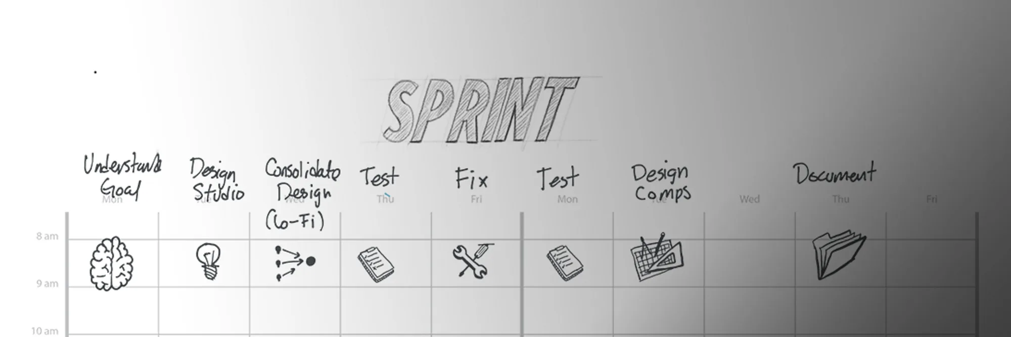
Since this was the first time a product attempted to parse, understand and visualise state court judge decisions, I led design activities to make sure we got design right. These design activities included:
These are some of the activities that I did during the design phase of the SDLC
Collaborative Design
Sketches
Wireframes

Comps
Usability Testing
Design System
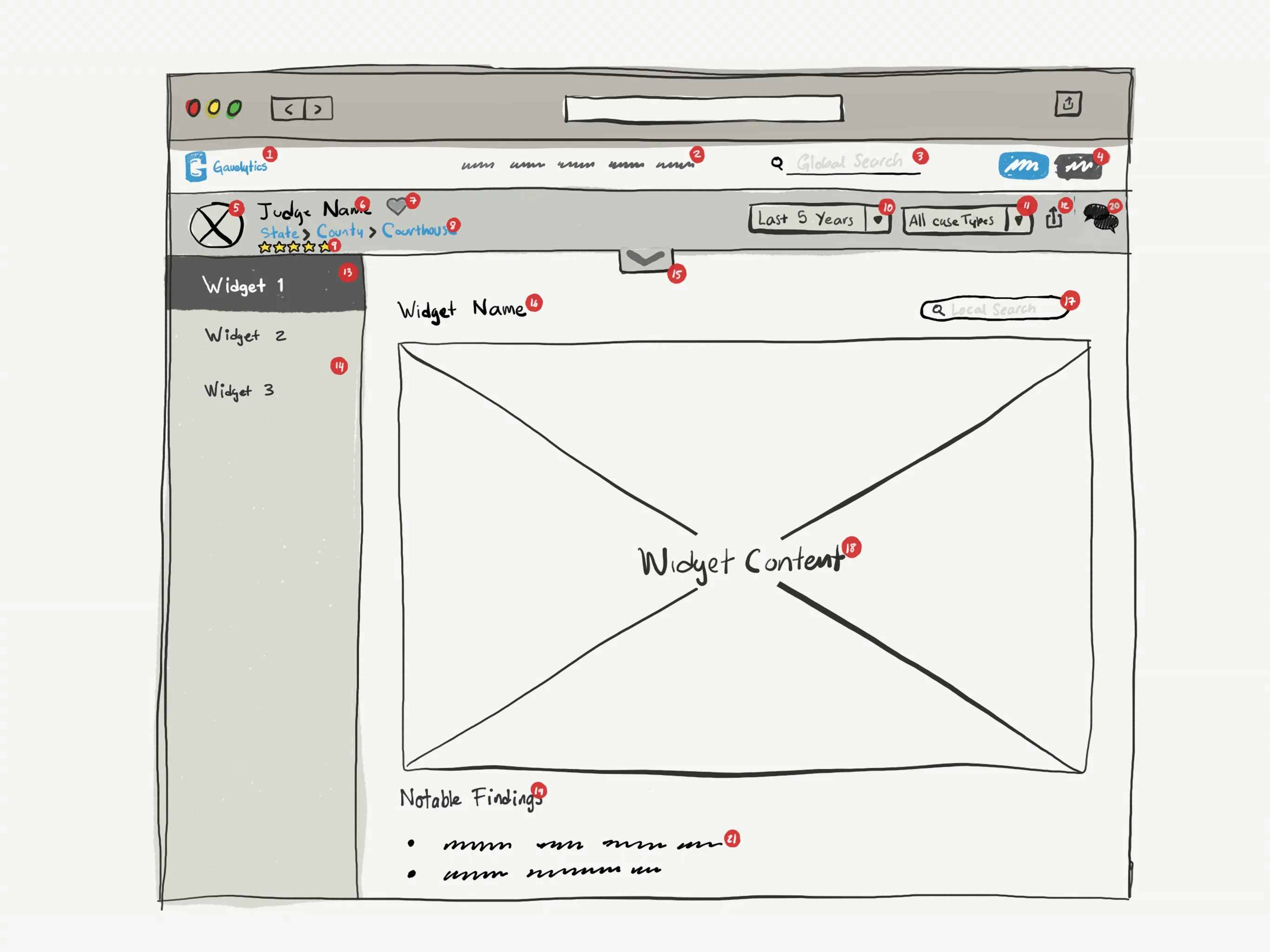
High Fidelity Feature Comps (as seen in the product)
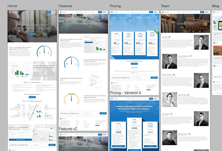
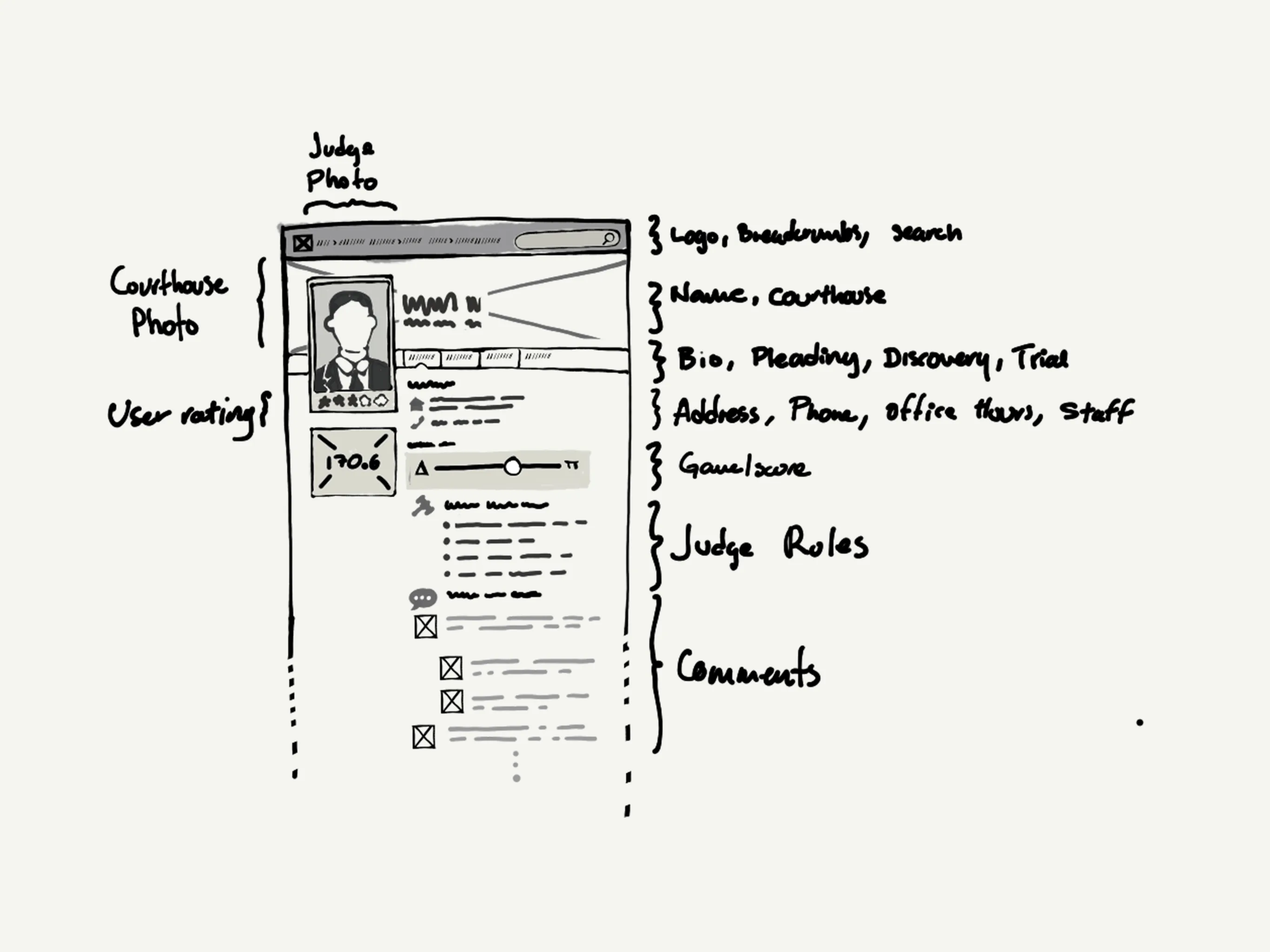
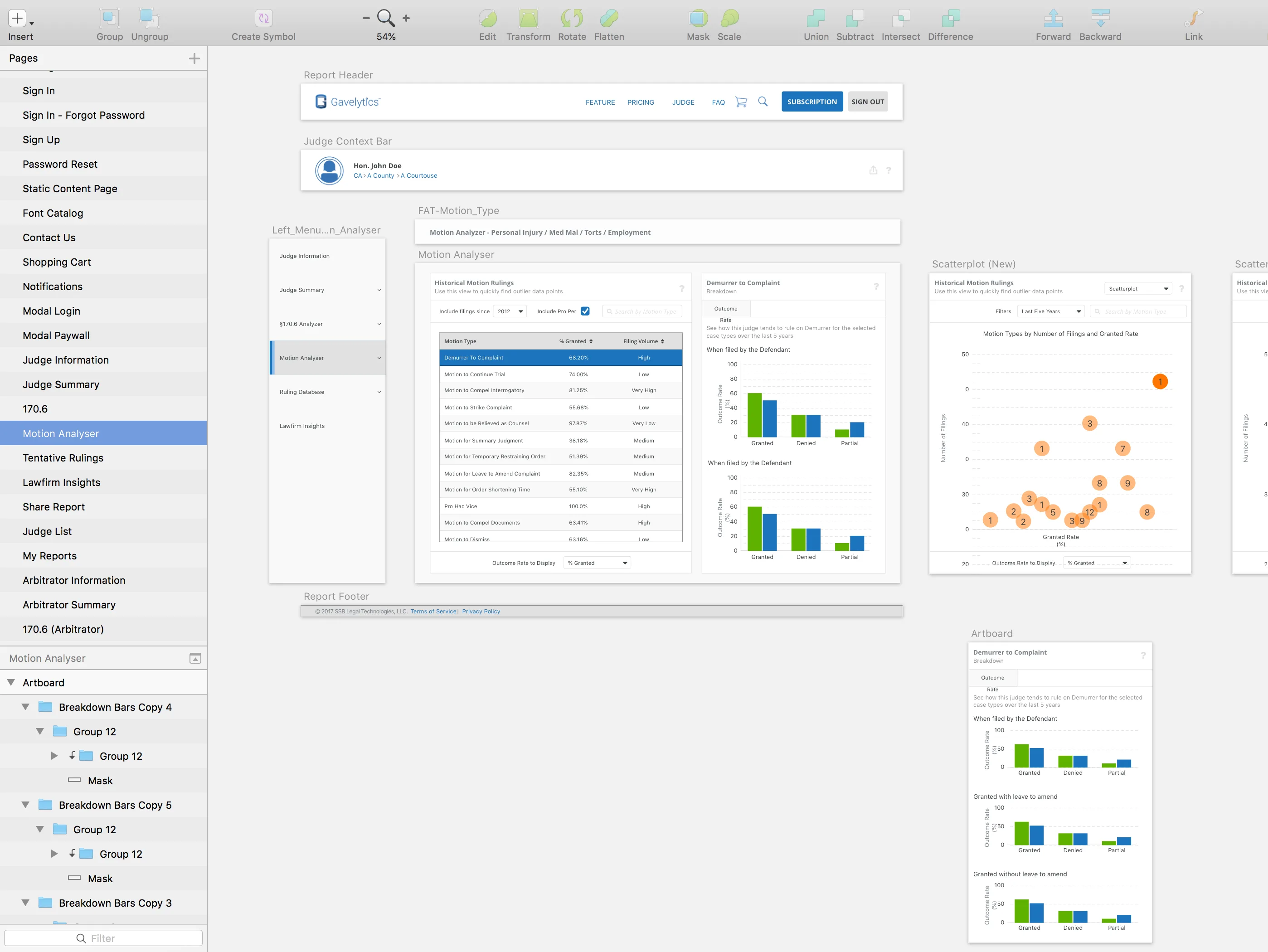
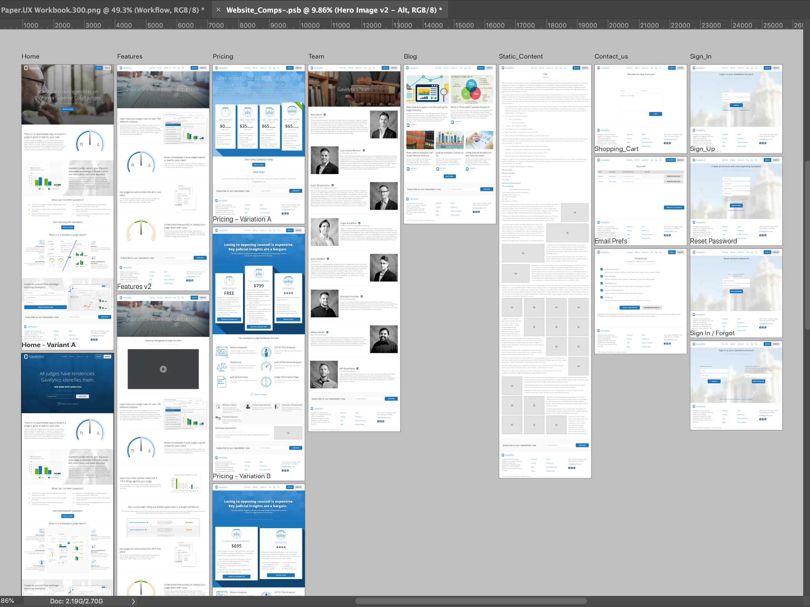
I created these wireframes in a workflow that used tools like Sketch, Photoshop and Zeplin, and are currently the production version of Gavelytics' Look and Feel.
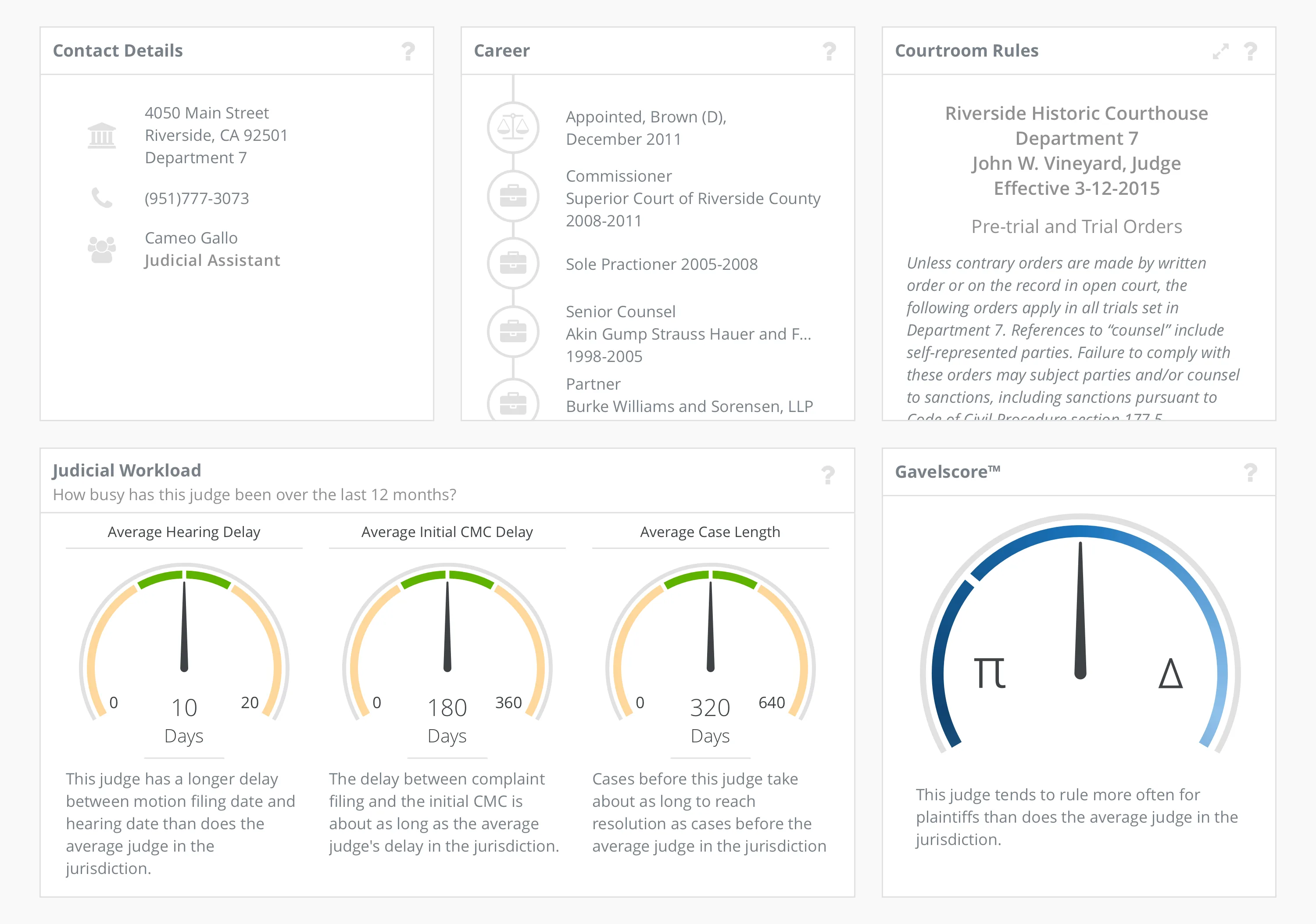
Judge Information
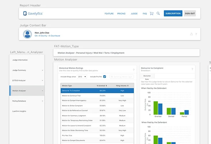
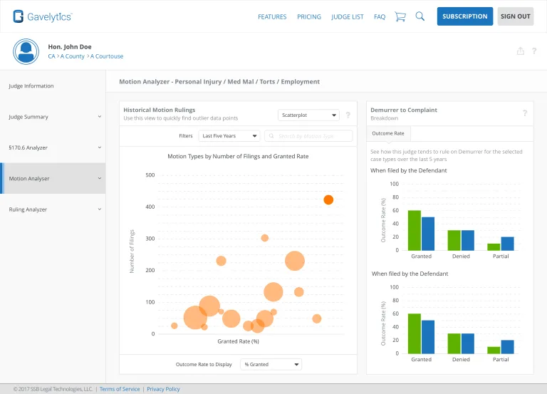
Motion Analyzer
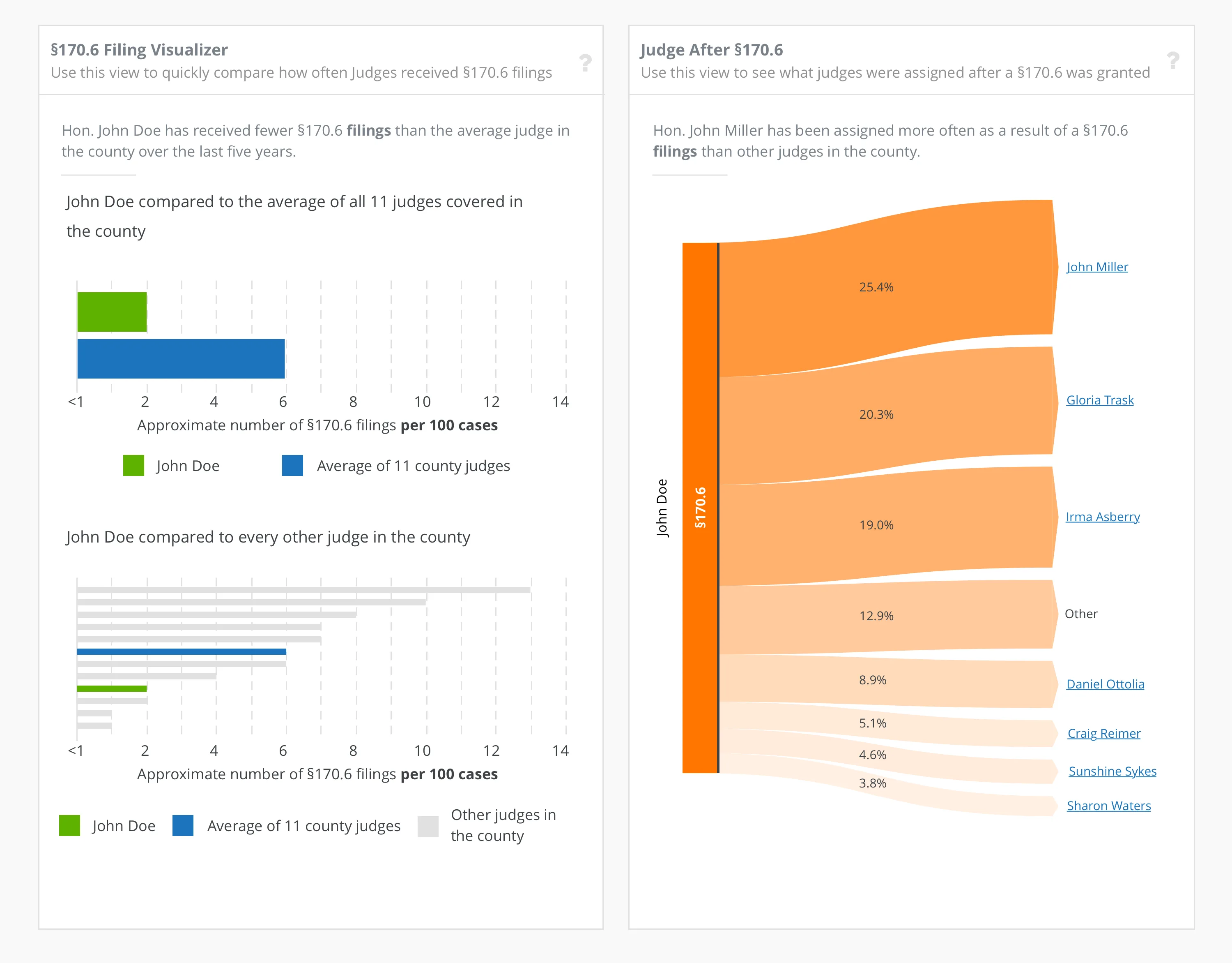
§170.6 Analyzer
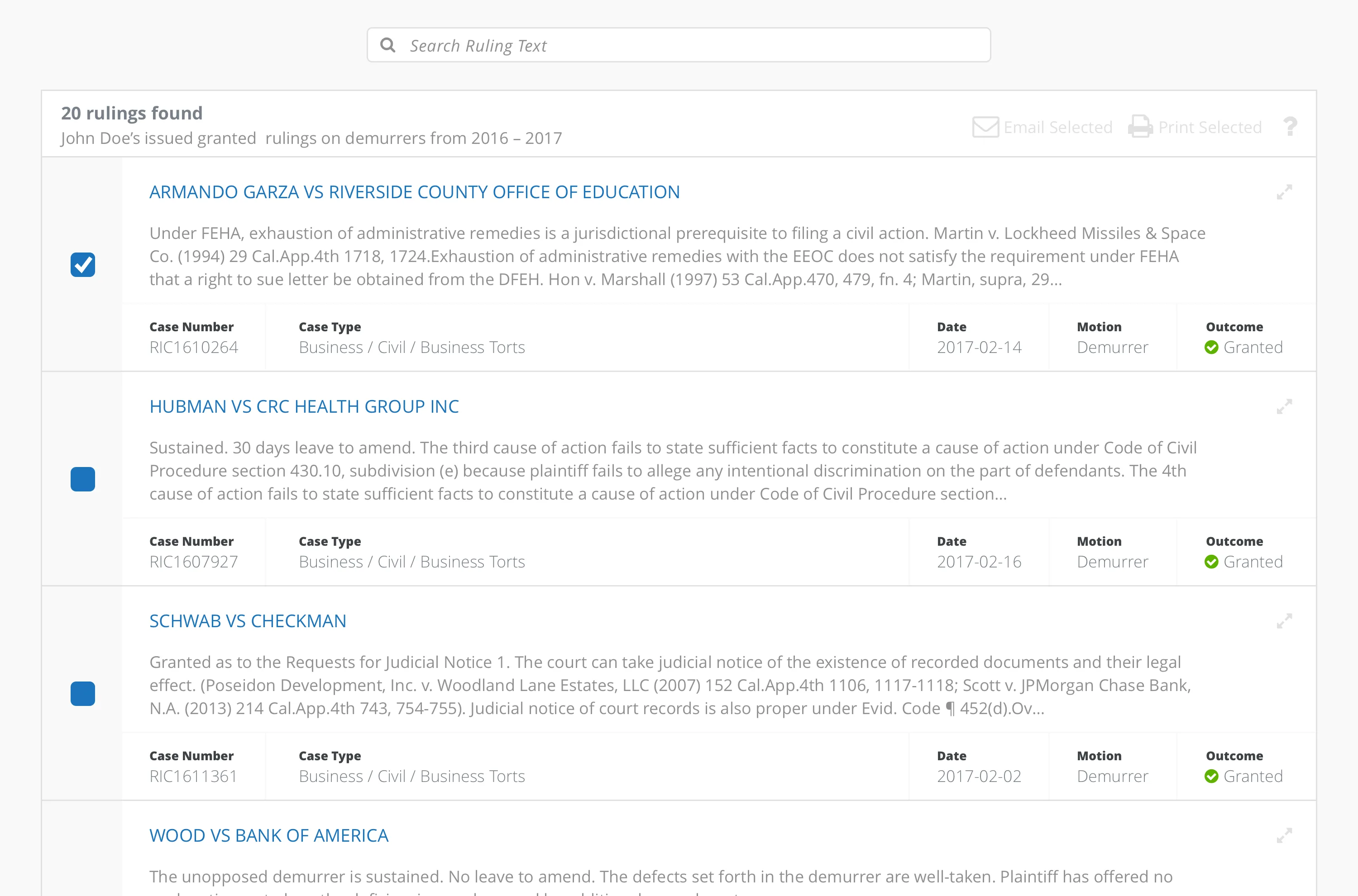
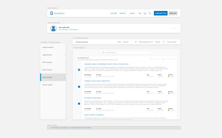
Ruling Database
Process
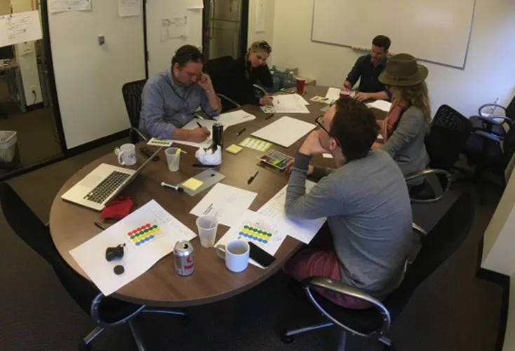
Collaborative Design
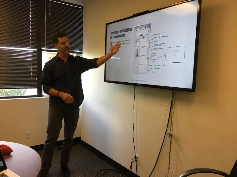
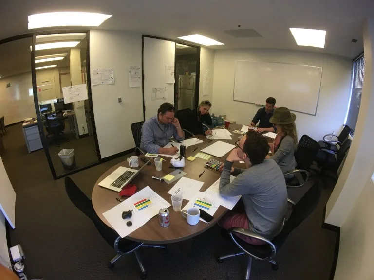
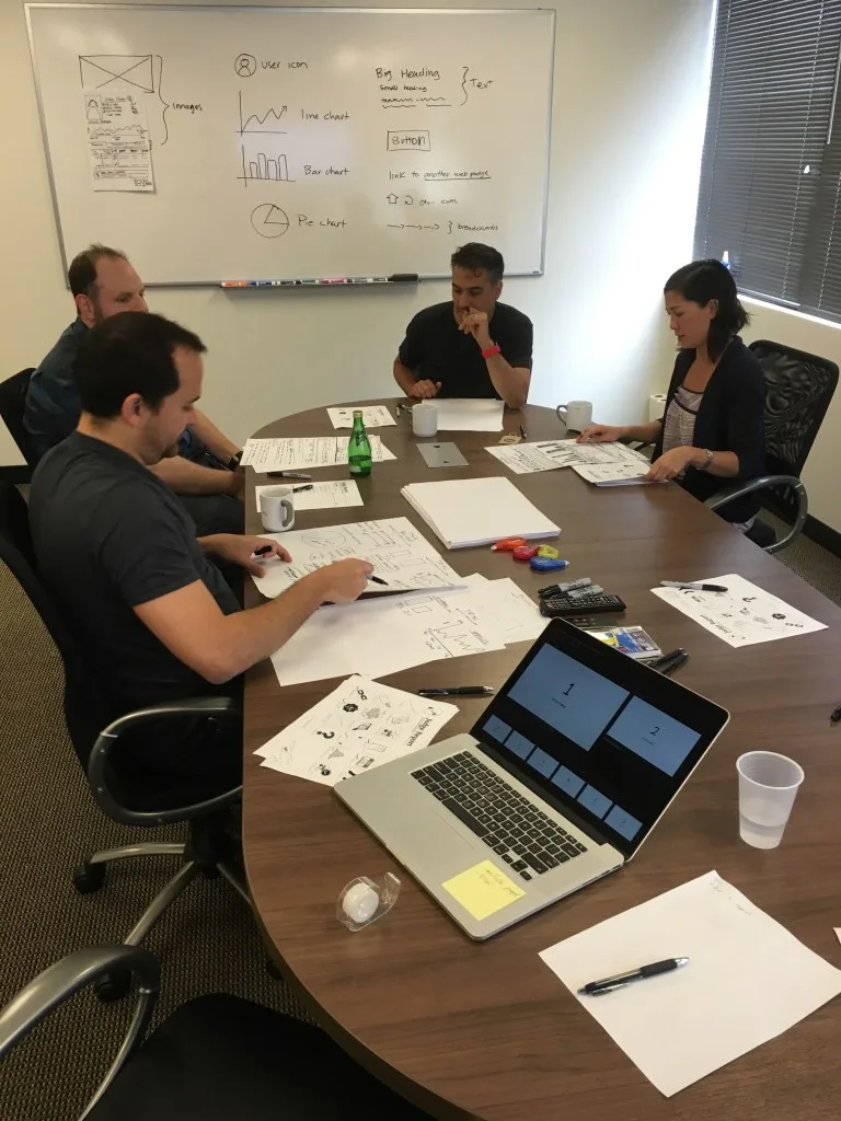
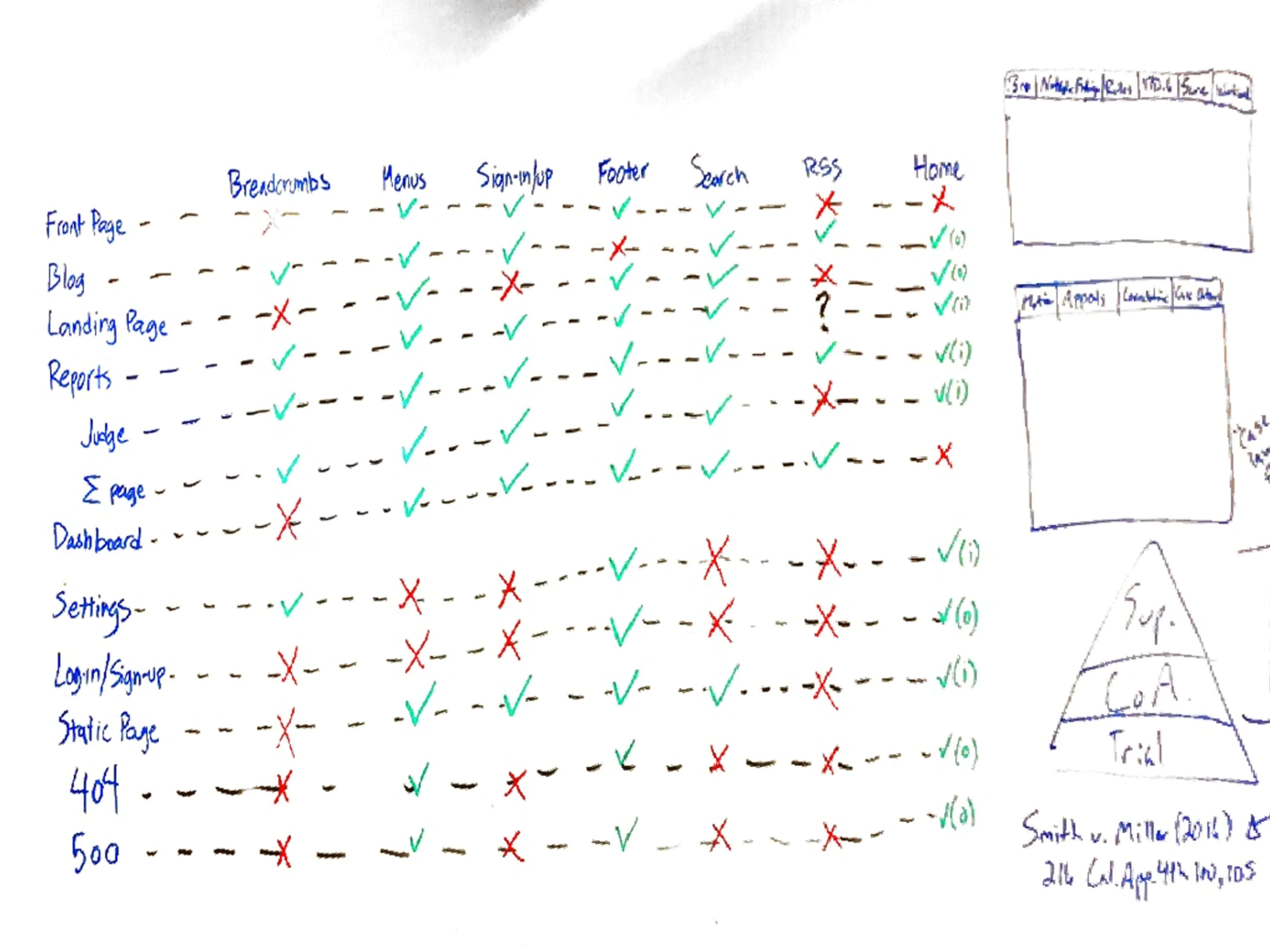
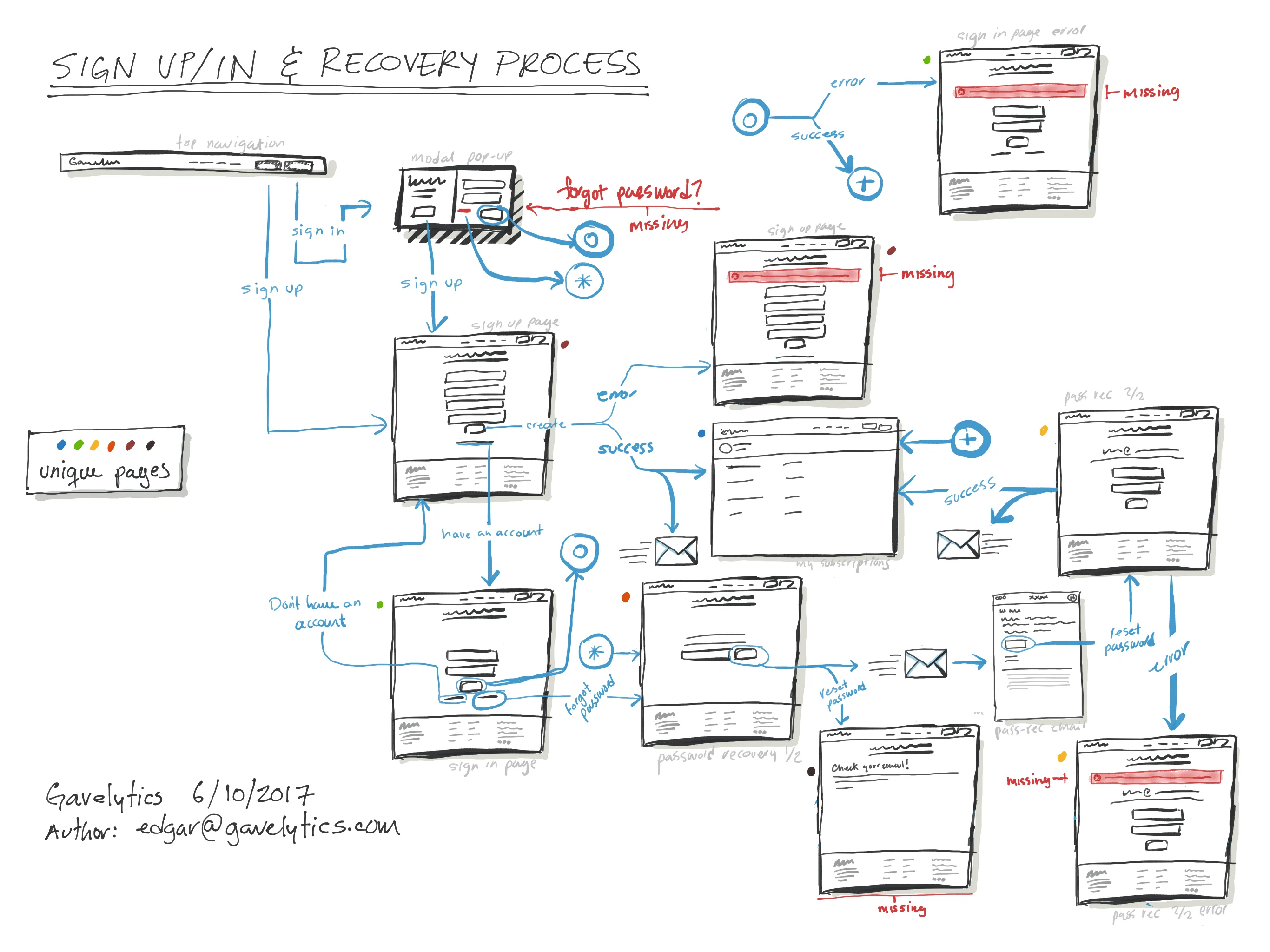
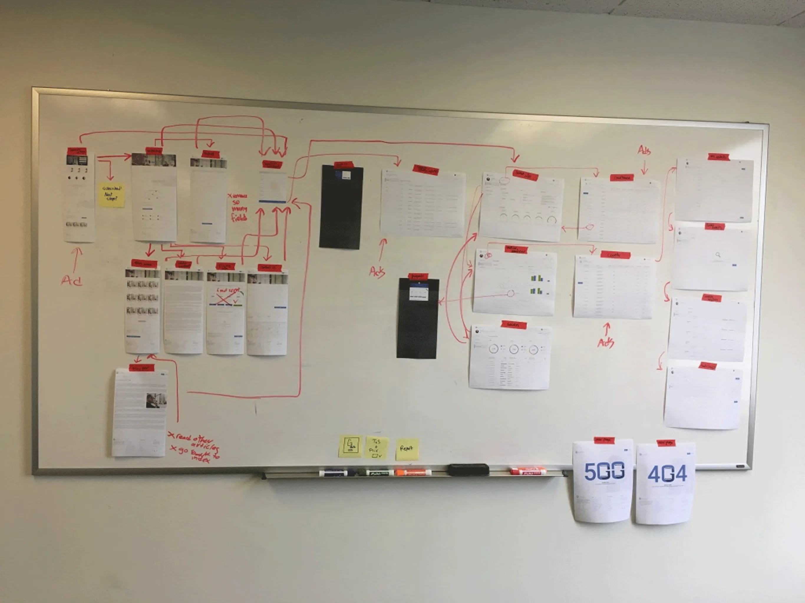
In order to understand the user’s mental model of what a solution should be, I periodically sourced and organised collaborative sketching sessions with our personas, where we pitched the high-level problem we had, fleshed it out a bit more through a brief discussion, and started sketching through a design-thinking activity called Design Studio (or Charade), where people get to rapidly iterate designs until they reach an acceptable design maturity.
Convergent design – sketch
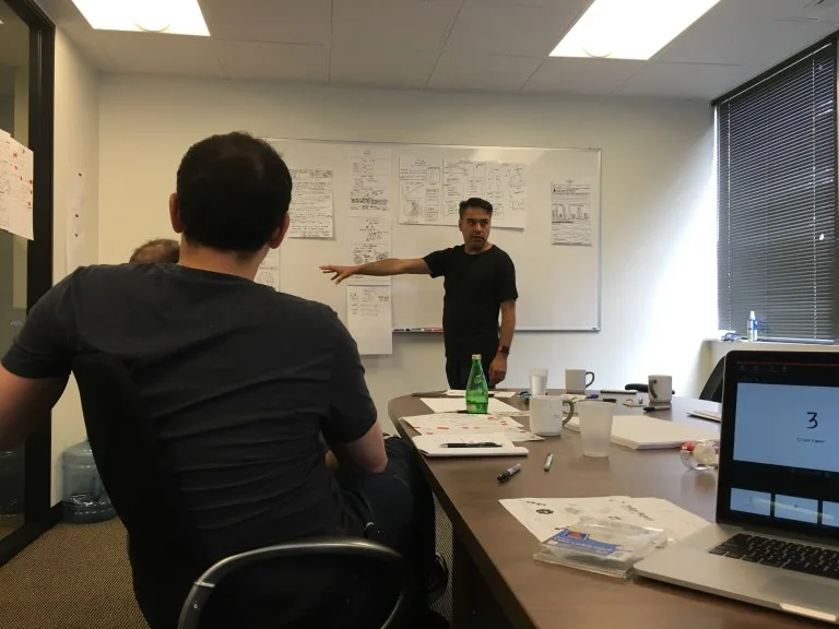
- During the presentation of the second round of design, as patterns start to appear, I start jotting them down paying attention to the following:
Similar UI components used from one design to another.
Common design considerations.
Common interactions.
Technical constraints.
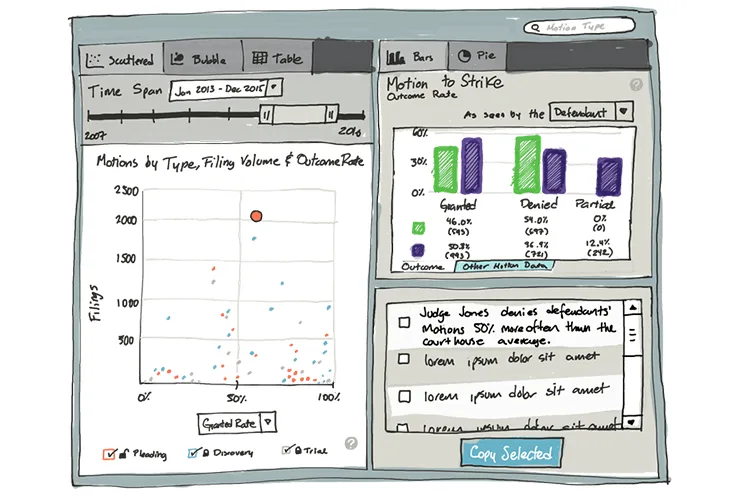
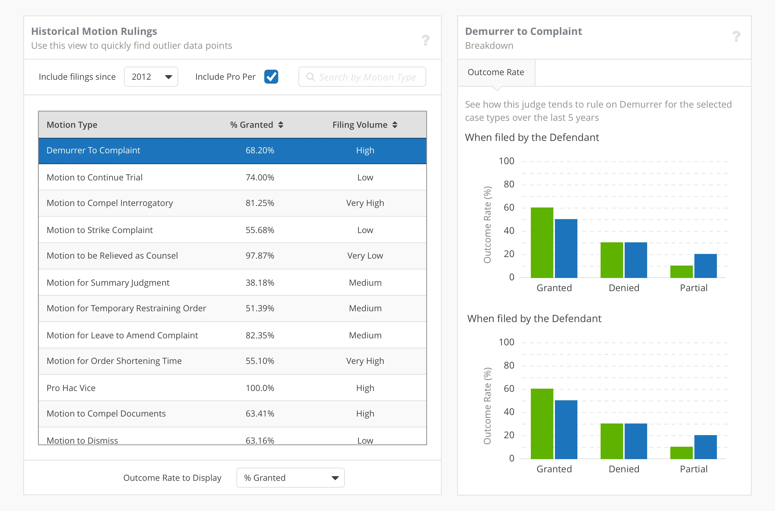
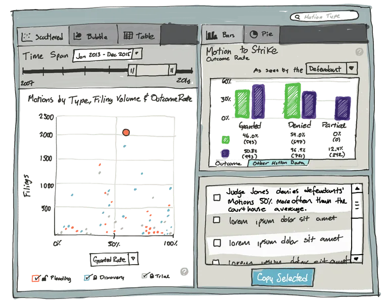
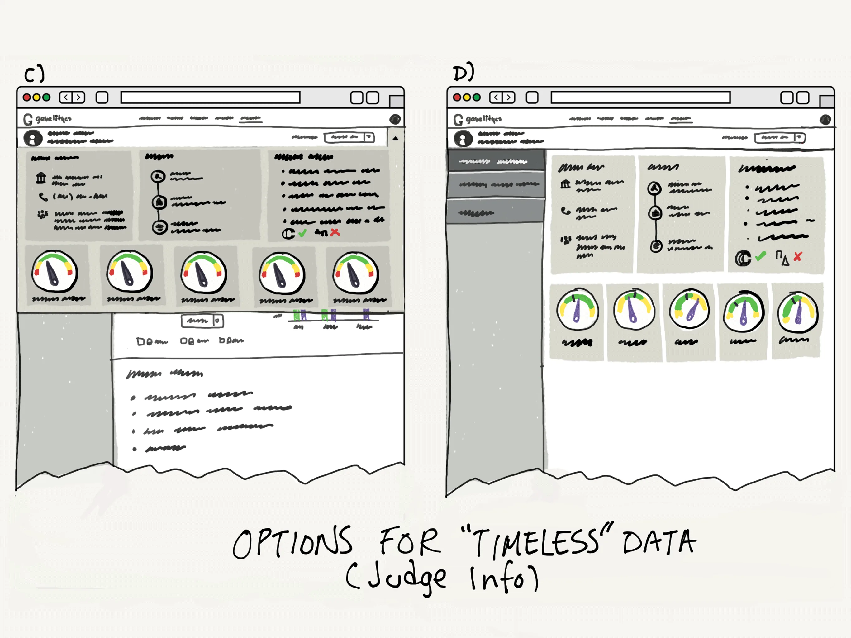
- Designing the main feature of our web-app, the “Motion Analyser” was challenging, as the design constraints stated:
Make “boring lawyerly stuff” sexy,
Make information available at a glance without having to skimming text.
- And the solution had to:
Allow litigators to find outlier motion data
Allow litigators to browse through all motions at a glance
Find the granted or denied rate of particular motion.
Find the volume of motions filed before a judge, broken down by plaintiff, defendant, and comparison to county statistics.
Filter motion data by time-frame
Filter motion data by name
The solution became this:
I performed a round of usability testing to seek validation at this fidelity. The usability test, an observation session, included a few different states of the software. I moderated and the whole team present in the usability test took notes.
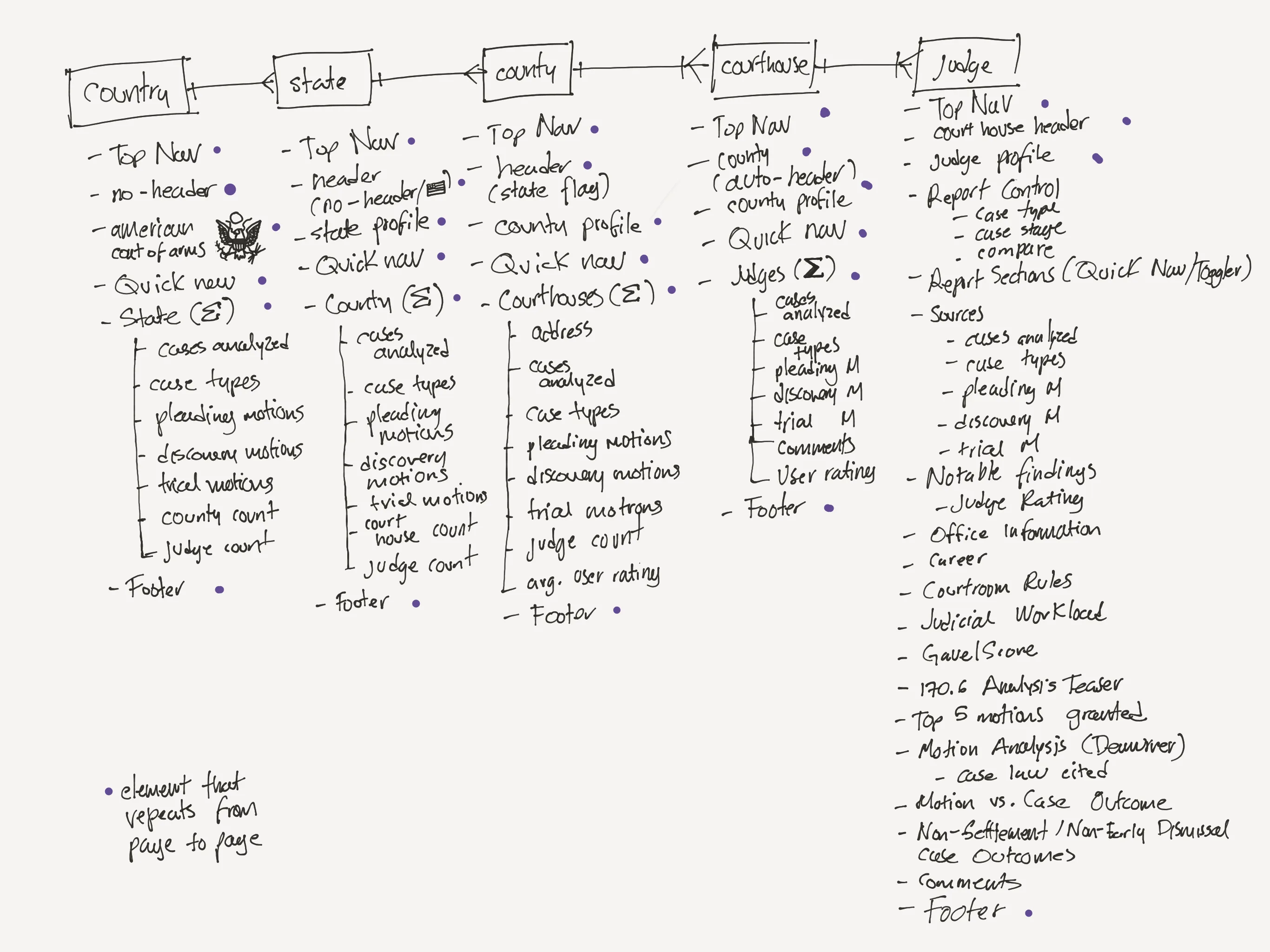
Low-fidelity wireframing
We fixed some of the issues in a prototyping tool once we had learn a bit more about the design.
Usability Testing
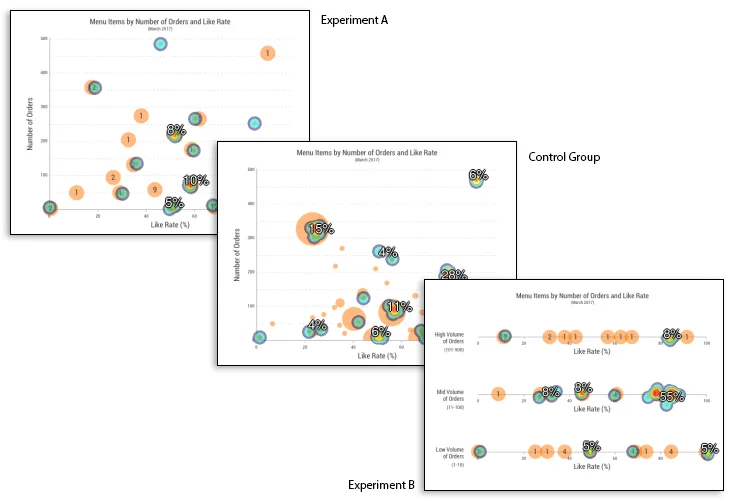
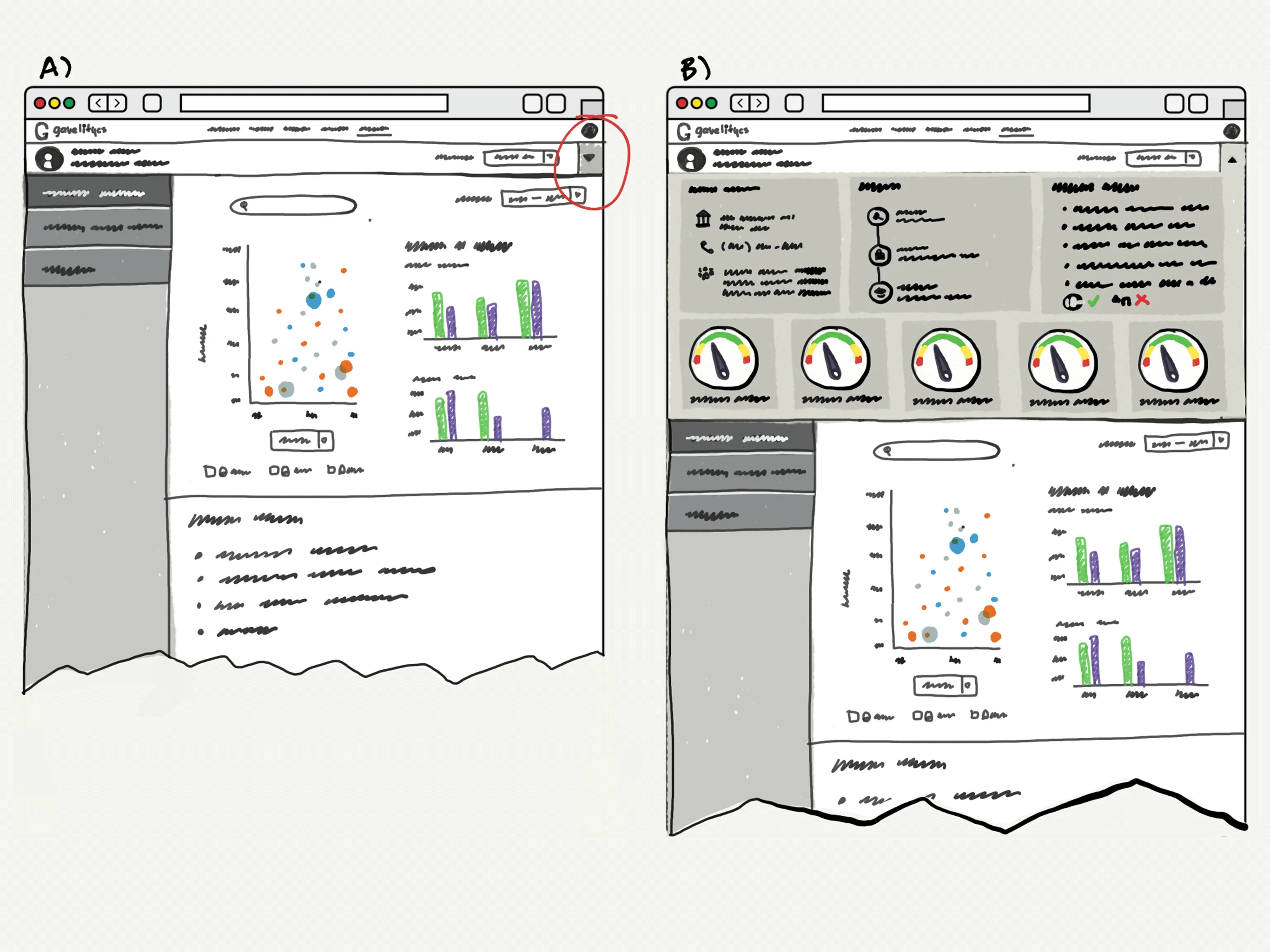
Unsure of the friendliness of the scatterplot (after watching some of our users struggle with it) we decided to explore different options, and conducted an “incognito” A/B testing with two alternatives to the scatterplot.
You want to find a menu item that is well-liked, but has only moderate sales. Assuming that clicking on a chart element will display further information about it, where in the chart would you click to find this information?
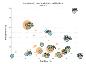
Successful: 20 (20%)
Avg. Time on Task (11.9s)
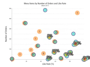
Successful: 14 (25%)
Avg. Time on Task (10.1s)
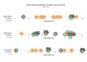
Successful 24 (44%)
Avg. Time on Task (8.6s)
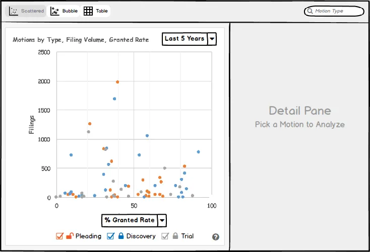
We got better results with the rightmost solution, however it was still low. And we decided to discard the scatterplot in favour of a table as the main UI element on that page, and added the scatterplot as a complementary view, when it was originally the other way around. Task Success went to 78%.
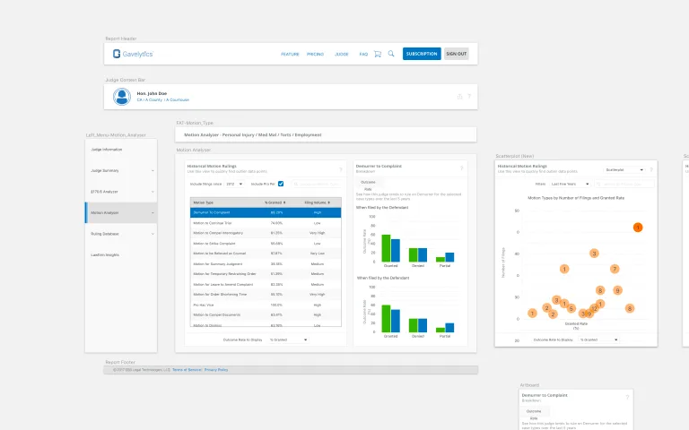
High-fidelity wireframing
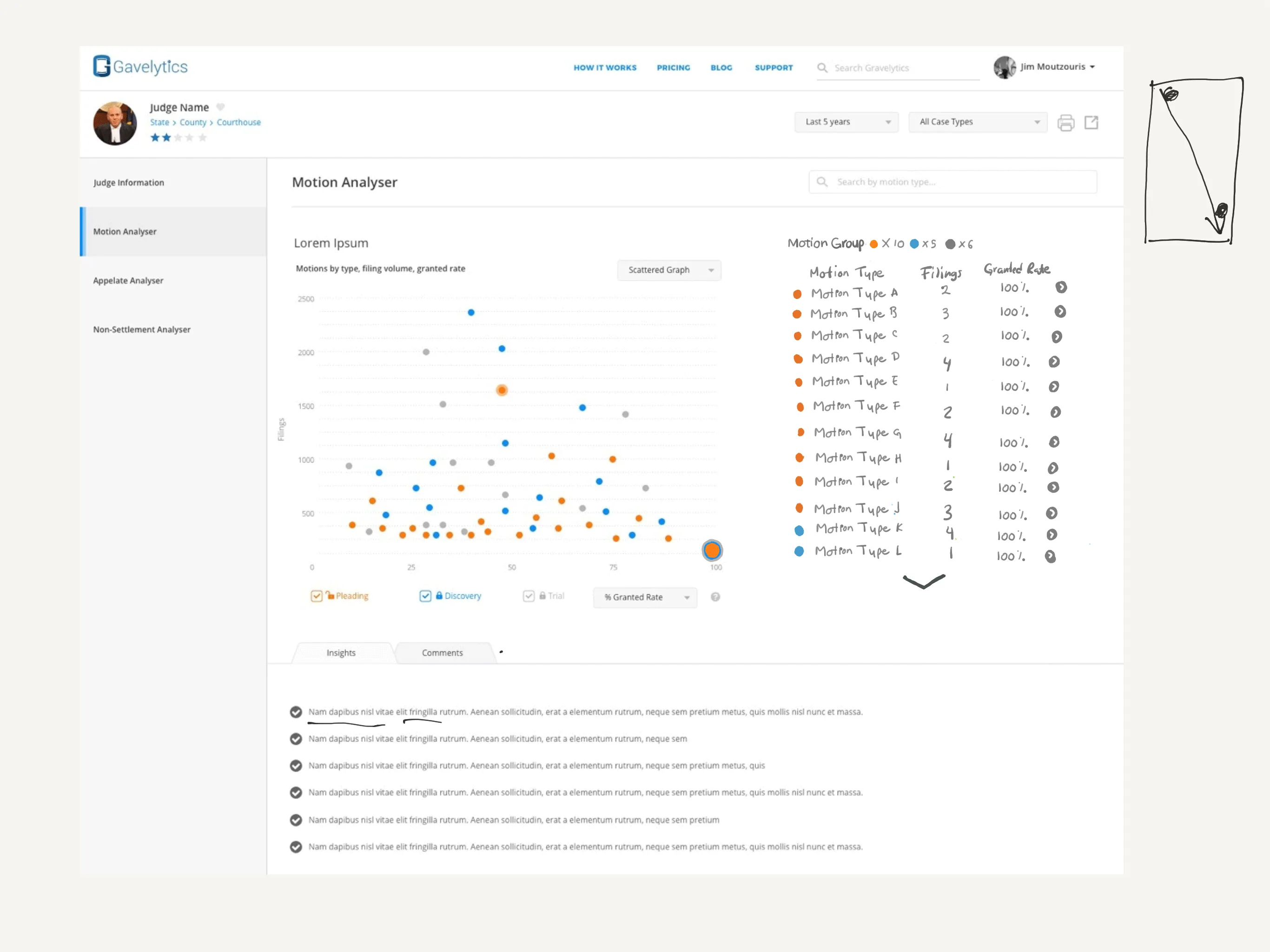
In the high fidelity wireframe below, you can see the secondary view of the motion analyser. This is the version that went live.
Design System
Our system, included 6 main features with a number of sub-feature within them. To keep consistency across all of them I put together a Sketch àPhotoshop workflow that allowed me to create and reuse individual pieces of design across multiple screens, override some of their values, and then consolidate everything in photoshop.
Edgar held the role of Director of Product & UX at Gavelytics between 2016 – 2017 in Los Angeles, CA.
RELATED CASE STUDIES