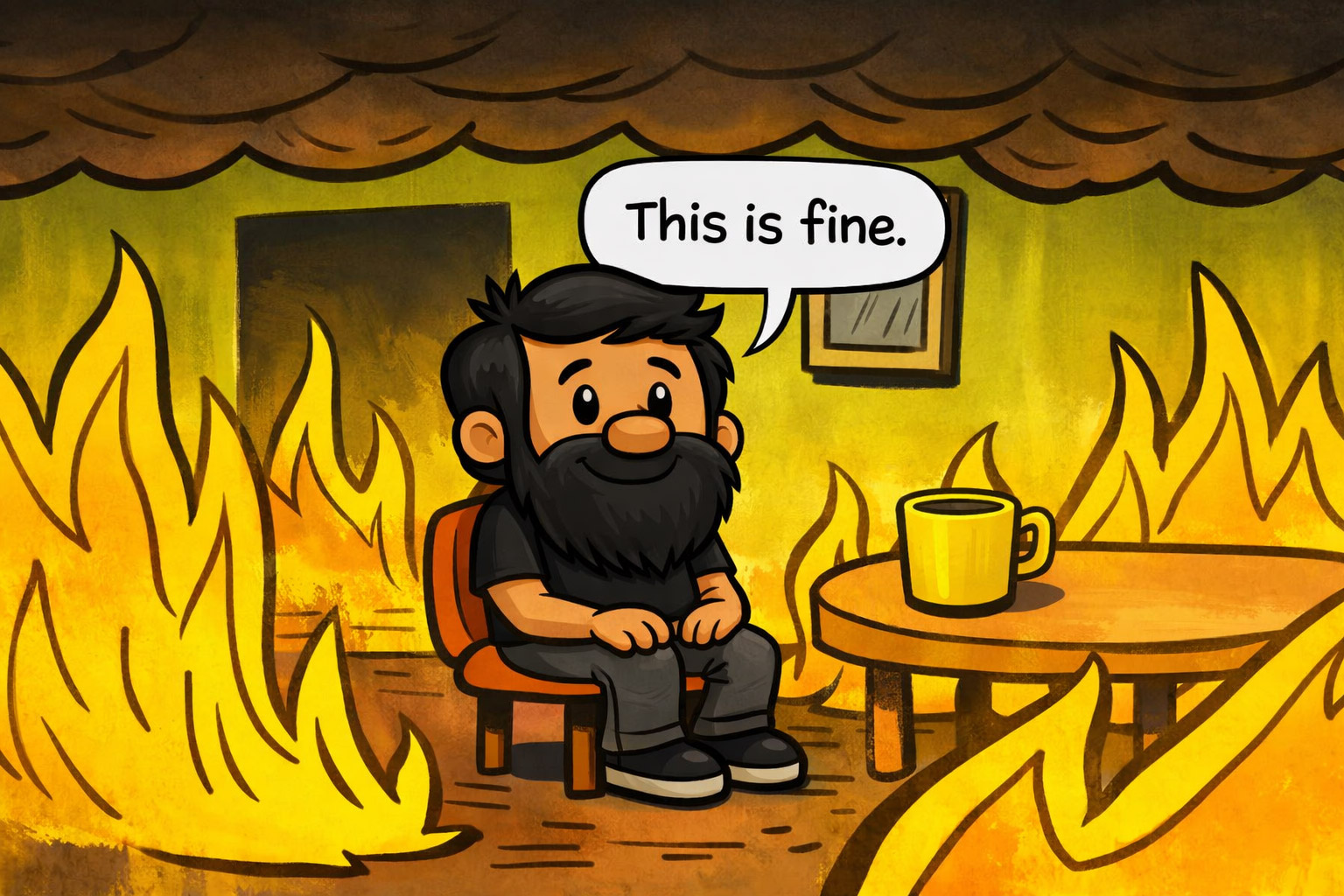
A few weeks ago, an AI agent I built suggested I write a blog post about designing oversight UI for AI agents.
The agent is called the Angle Engine. It lives inside my CMS, reads my entire blog corpus, scans the web for what's heating up, finds the gaps between what I've written and what's trending, and surfaces ideas with briefs already drafted. Hooks, sources, persona notes, conversation starters. Ready to go.
It generated this brief. The one I'm writing from right now. About how to design oversight UI for AI agents; produced by an AI agent operating with minimal oversight; in a system I was actively building oversight UI for; while writing about why oversight UI matters. The recursion isn't a gimmick. It's the whole problem in one frame: agents are already shipping work into our pipelines faster than we've figured out how to stay relevant to it.
Meanwhile, on LinkedIn, I keep seeing the same red-banner clickbait: UX is dead. Long live AIX. Agent Experience is the new discipline. The argument runs that designing for users is over because users aren't the primary actor anymore; agents are. So we need a new field, new patterns, new specialists, new conferences. AIX. Agent Experience Design. Coming soon to a job title near you.
I think this is exactly wrong, and I think it's wrong in a way that's about to cost us a lot.
Here's the actual situation. Gartner expects 40% of enterprise apps to have task-specific AI agents embedded in them by the end of 2026, up from under 5% in early 2026. The EU AI Act's human oversight requirements (Article 14) are now in force. The law explicitly demands that high-risk AI systems be designed so humans can effectively oversee them, including, in plain language, designing the interface so humans don't drift into automatically trusting the output.
So we have a market exploding into agent-driven software, a regulatory requirement already in force, and a discourse arguing that this is not UX's job but AIX's. I want to make the opposite case.
Oversight UI (the interface layer that keeps humans relevant while agents work) is the most important UX problem of the next two years. It's not a new discipline but interaction design with higher stakes and a law behind it. "Agent experience" is a new name for a job UX already has. The agents don't need a new field to advocate for them. The humans working alongside them need a UX discipline that knows how to keep them in the loop, in context, and in command.
~9 minute read. You'll leave with: a decision matrix, five Pattern Cards, four architecture commitments, and a checklist you can take to your next design review.
What's in this post
|
What the agent didn't know about me
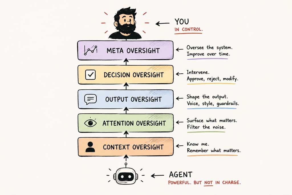
The first version of the Angle Engine was stateless. It worked beautifully in isolation and uselessly in context.
Here's what that meant in practice. I'd open the tool. It would scan my corpus, scan the web, find some interesting gap, and confidently hand me a brief: "Edgar, you should write about [thing]. Here's the hook, three sources, why now." The brief would be coherent, well-researched, on-trend. It would also, half the time, suggest something I'd already written about, didn't care about, or had explicitly decided wasn't my lane.
The agent had no memory of last week's brief. No record of what I'd accepted or rejected. No signal for what I was gravitating toward. Each session started from zero. It was a brilliant synthesis machine with the long-term memory of a goldfish.
I sat with it for a while before fixing it; partly because I was curious what it would teach me, partly because I'd written a piece a few years ago called Stop and Think Design and I try to take my own medicine. What sitting with it taught me was this: the gap between a useful agent and a useless one isn't capability. It's context.
The agent could read a thousand articles in the time it took me to read one. It could spot a pattern across my whole corpus in seconds. What it couldn't do (what no amount of capability was going to fix) was hold the things that only live in my head. What I'd already decided not to write about. Why I'd decided it. Who I was writing for this month. The taste I'd built over twenty years of doing this work, which tells me in half a second whether an angle is worth pursuing.
A human brain holds that context for free. An agent has to be told.
So I started building the layer underneath. Statefulness, so the agent could remember what it had suggested and what I'd killed. Signal tracking, so it knew what was heating up versus what was just loud. Heat scores on individual brief candidates, so I could scan twenty briefs in fifteen seconds. A second tool (Dot Connector) pulling signals from the wider web into a stateful inbox. A third (SERP and Destroy) reverse-engineering tactical SEO angles from my essays. A fourth (Oolkin) holding editorial voice so the agents generated in my register instead of generic GPT-house-style. I'll come back to all four in a table further down.
None of these tools work alone. None of them were planned in advance. Each one got built because I felt the seam where the previous tool was failing me, and I designed the next layer to close it.
What I didn't recognise, until I stepped back, is that what I'd built was an oversight system. Not a productivity system. Not a content pipeline. An oversight system. Each tool I added was a new surface for me to stay relevant to what the agents were doing. The sparkline on each brief is an oversight UI element; it lets me reject the thin ones at a glance. The stateful memory is an oversight mechanism; it stops the agent re-suggesting things I've killed. The voice profile in Oolkin is oversight; it constrains what the agent can generate so it doesn't drift away from me.
I built all of this because I wanted to stay in the loop on my own thinking. The fact that it's also exactly what the EU AI Act calls for in Article 14 (interfaces that let humans "effectively oversee" the system, "remain aware of the possible tendency of automatically relying or over-relying on the output", and intervene meaningfully) was a happy accident of doing the work properly.
That's the move I want designers to internalise: oversight UI isn't a separate feature you bolt on. It's what good agentic design is. Build an agent without it and you haven't built a faster tool; you've built a context-blind one. Context-blind tools, no matter how capable, will always generate output that misses the mark in the ways that matter most to the human supposed to be using it.
HITL vs HOTL: when to gate, when to delegate
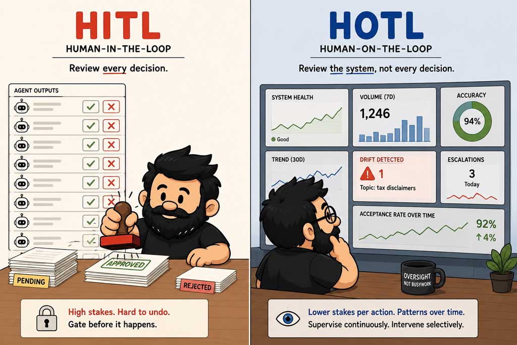
Once you accept that oversight UI is what good agentic design is, the next question is structural: where does the human actually plug in?
Two terms from the human-AI oversight literature cut the problem cleanly. Human-In-The-Loop (HITL, a human approves before the action runs) and Human-On-The-Loop (HOTL, a human supervises a running system from above, intervening when patterns drift).
HITL is approval before action. The agent generates something. The human reviews it. Only after the human approves does it ship, execute, or commit. The human is a gate; nothing passes without judgement.
HOTL is supervision over time. The agent runs continuously. The human watches the system from above (dashboards, alerts, escalation rates, drift signals) and intervenes when something looks off. The human is a supervisor; not blocking each action, but tuning the system so the actions stay good.
Most agentic systems need both. Not one or the other; both, at different points in the pipeline, for different categories of decision. Pick one mode and apply it everywhere and you get the two predictable failure shapes: gate everything (you've killed the speed advantage that made you build the agent in the first place) or gate nothing (you've shipped an autonomous system that generates content, decisions, or actions nobody actually wanted).
The right design is HITL where the stakes are high and irreversible, HOTL where the stakes are distributed across time.
If the action is hard to undo, gate it.
Action | Stakes | Reversibility | Mode | Why |
|---|---|---|---|---|
Send a single customer email | Medium | Irreversible | HITL | One-shot relationship moment |
Tag incoming support tickets by category | Low | Reversible | HOTL | Supervise tagging accuracy over time |
Publish a blog post | High | Partly reversible | HITL | Reputational; once read, read |
Pull web signals into a reading queue | Low | Reversible | HOTL | Pattern-level tuning, not per-item |
Delete a record | High | Irreversible | HITL | Data loss is permanent |
Charge a card | High | Irreversible | HITL | Financial; refunds aren't free |
Surface recommended next-actions | Low | Reversible | HOTL | Supervisory; the human still chooses |
Stakes legend: Low = reversible within minutes, bounded blast radius. Medium = reputational or single-customer impact. High = financial, legal, or data loss.
Composite actions inherit the strictest mode of any sub-step. An agent that drafts and sends in one operation is HITL on the send.
When stakes and reversibility disagree, reversibility wins. A medium-stakes irreversible action gates harder than a high-stakes reversible one.
Article 14 of the EU AI Act actually points in this direction without naming it. For some high-risk decisions, the law requires verification by two competent humans before action; that's HITL with redundancy. For monitoring and post-deployment, the law expects ongoing human oversight of the system's operation; that's HOTL. The law isn't prescriptive about how you build the interface. It's prescriptive about that you build it, and that the design has to enable both modes meaningfully.
Compliance is the floor; the patterns below aim higher. Article 14 forces you to ship oversight; what kind of oversight you ship is still a design decision.
HITL has a failure mode that the HOTL camp loves to point at, and they're right to. Reviewer fatigue. When every action is gated, the human in the loop sees the same kind of approval prompt a thousand times a week, and the cognitive cost of actually reading each one collapses into a rubber-stamp reflex. The gate is still there but the judgement is not. That's automation bias creeping in through a door HITL was supposed to close. Mitigations exist; see the callout below; none are optional once your gate volume crosses a few hundred a day.
Three fatigue mitigations (none optional past ~few hundred gates/day, a rule of thumb from my own deployments rather than published research)
|
The interface has to fight automation bias on purpose
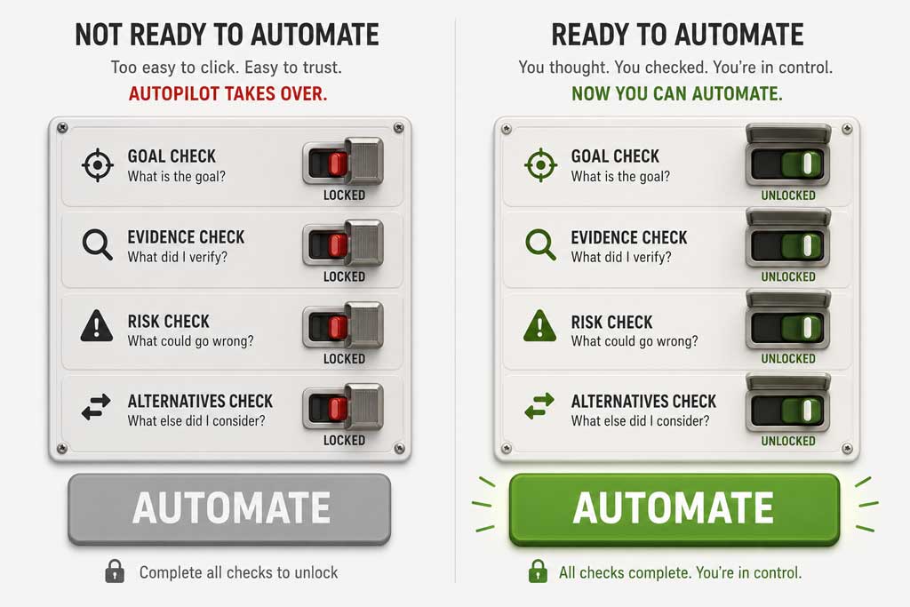
Bottom line: confident-looking output makes humans stop checking. Design the interface to interrupt that.
Here's the part most agent designers haven't sat with yet, and it's the part the radiology and pathology fields have been writing warnings about for a decade.
When an AI system produces output that looks authoritative (polished, confident, well-formatted) human reviewers stop scrutinising it, though not consciously. The presentation does the work underneath their awareness. Their critical distance collapses. They were supposed to be the gate. The interface bypassed the gate without anyone noticing.
Automation bias in clinical decision support is well documented. In one computational-pathology study (Rosbach et al., 2024; n=28), trained experts overturned their own correct judgements to follow incorrect AI advice in roughly 7% of cases, with severity rising under time pressure. Earlier systematic reviews (Lyell and Coiera, JAMIA 2017) associate automation bias with single-task diagnostic settings under high cognitive load; exactly where confident-looking agent output sits.



Now imagine that dynamic in an enterprise app where a customer-service agent drafts a refund decision, an ops agent suggests escalating a security incident, or a hiring agent ranks candidates. The reviewer on the other side isn't a trained specialist. They're working through a queue. The output looks finished. They click approve.
Article 14 calls this out directly, requiring that oversight personnel "remain aware of the possible tendency of automatically relying or over-relying on the output produced by a high-risk AI system". That isn't a vibe. It's a regulatory mandate to design against the bias. Which means the interface has to make the human think. Not in a vague "encourage critical thinking" way; in a concrete "the UI does work to interrupt the autopilot" way. Here are five patterns that make the interface do that work.
Five patterns against automation bias
The research is consistent: confident-looking output collapses critical distance, and one-click approval is where automation bias lives. These five interface patterns are the smallest set that materially shifts oversight from rubber-stamp to genuine review. They are not exhaustive; they are the ones I keep coming back to when the post-mortem says "the reviewer approved it without thinking".
Pattern | When to apply | Anti-pattern |
|---|---|---|
1. Surface uncertainty | Any agent output with a measurable confidence signal | Confidence in a tooltip nobody opens |
2. Force articulation at the gate | High-stakes, irreversible actions | Friction everywhere or no friction on destructive actions |
3. Separate generated from grounded | Output mixing reasoning with retrieved sources | Undifferentiated authoritative-looking prose |
4. Make reversal cheap and visible | Any action with a reversibility window > 0 | Undo three menus deep |
5. Log the reasoning, not just the outcome | Every gated approval | Audit log without the "why" |
Scan the table for the pattern matching your situation, then drop into the card for the concrete UI and pairings.
1. Surface uncertainty
Problem: confident-looking output collapses critical distance. The agent does not know what it does not know, and the reviewer inherits that blind spot.
When to apply: any agent output with a measurable confidence signal (retrieval score, model logprob, retrieval coverage, source recency).
Concrete UI: let confidence drive visual treatment. Low-confidence outputs render faded, flagged, or require a second click before they can be approved. Treat uncertainty as a layout primitive, not a metadata field.
Anti-pattern: a confidence score in a tooltip nobody opens.
Pairs with: Pattern 3 (Separate generated from grounded); Pattern 4 (Make reversal cheap).
Spec: confidence < 0.5 → faded; < 0.3 → second-click required.
2. Force articulation at the gate
Problem: one-click approval is where automation bias lives. If approving costs nothing, reviewers approve everything.
When to apply: high-stakes, irreversible actions (sending, publishing, deleting, paying).
Concrete UI: a short "why are you approving / what could go wrong" prompt at the gate. Free-text, two lines, captured for audit. Acceptable articulation references a specific risk, source, or override reason. 'lgtm' fails the rubric. The friction is the feature.
Anti-pattern: friction on every action (which produces fatigue) or no friction on destructive ones (which produces rubber-stamping).
Pairs with: Pattern 5 (Log the reasoning).
Spec: HITL gates ≥ "Medium" stakes require ≥ 1 sentence articulation; capture verbatim.
3. Separate generated from grounded
Problem: synthesis and citation read as equally authoritative when they share a typeface. Reviewers cannot tell which sentence the agent decided and which sentence it sourced.
When to apply: any agent output mixing reasoning with retrieved sources (research summaries, briefs, recommendations).
Concrete UI: inline citations, visible source provenance, and a visual delta between "agent decided" and "agent reports". Different background, different prefix, different colour stop.
Anti-pattern: undifferentiated, authoritative-looking prose.
Pairs with: Pattern 1 (Surface uncertainty); Pattern 5 (Log the reasoning).
Spec: Generated text uses sans + grey rule; grounded text uses serif + source pill.
4. Make reversal cheap and visible
Problem: hard-to-reverse actions punish second thoughts, so second thoughts stop arriving.
When to apply: any action with a reversibility window greater than zero (which is most of them, if you design for it).
Concrete UI: a 30-second undo banner; a scheduled-for-tomorrow queue; a draft that only becomes real on delay. The undo lives where the action just happened.
Anti-pattern: undo buried three menus deep.
Pairs with: Pattern 1 (Surface uncertainty).
Spec: Low-stakes: 30s undo banner; medium: 24h restore; high: scheduled-for-tomorrow queue.
5. Log the reasoning, not just the outcome
Problem: outcome logs miss drift. Reasoning logs catch it. If you only record what shipped, you cannot tell whether reviewers were thinking or clicking.
When to apply: every gated approval, without exception.
Concrete UI: capture why at approval time (the articulation prompt feeds this), then surface it in the review history. The audit becomes a record of judgement, not just events.
Anti-pattern: an audit log of what shipped without why it shipped.
Pairs with: Pattern 2 (Force articulation at the gate); Pattern 3 (Separate generated from grounded).
Spec: Every gated approval logs: action, decision, confidence, human reasoning, time-to-decision.
Four architecture commitments
Patterns sit on top of architecture. If the system underneath does not support graduated permissions, sandboxing, reversibility, and self-instrumentation, no amount of interface polish will save you. These four commitments are what I bake in before the first screen gets designed.
Capability tiers, not all-or-nothing
Concrete example: the Angle Engine has five permission tiers (read / summarise / draft / send / delete). The first three run autonomously. The last two require human approval, and "delete" requires two approvers in sequence (a nod to Article 14's two-eyes principle, scaled down for a small team).
Minimum viable implementation: a permissions enum on every agent action, enforced at the API boundary (not just the UI). A tier-to-mode mapping (read = HOTL, send = HITL, delete = two-approver HITL). Audit entries that record which tier was invoked.
Trade-off accepted: more plumbing, slower feature velocity on destructive actions. Worth it; the alternative is a single "agent can do things" toggle, which is how you end up explaining a deleted production table to your cofounder on a Sunday.
Enables patterns: 2, 4.
Sandboxes for safe rehearsal
Concrete example: the Angle Engine drafts angles into a staging queue before publish. The agent acts on a copy of the world; promotion to production is a separate, gated step. Same for SERP and Destroy, which writes outbound drafts to a holding inbox rather than the live channel.
Minimum viable implementation: a staging table or queue for every action with side effects. A promotion endpoint that requires the appropriate tier of approval. Visual parity between sandbox and production output (so reviewers cannot tell the difference, which is the point).
Trade-off accepted: double the storage and a measurable lag between agent work and shipped work. The lag is what buys you reversibility; treat it as a budget line, not a bug.
Enables patterns: 3, 4.
Reversibility as a first-class constraint
Concrete example: Oolkin persona changes have a 30-second undo banner before they propagate. Angle Engine publishes are scheduled-for-tomorrow by default; same-day publish is an explicit override. Dot Connector dismissals stay reversible for 24 hours.
Minimum viable implementation: every destructive action ships with a reversal path (undo, restore, unschedule). Reversibility windows defined per action class (low-stakes: 30 seconds; medium: 24 hours; high: scheduled tomorrow). The reversal UI lives where the action happened, not in a settings panel.
Trade-off accepted: features feel slower. They are slower. That is the design; if speed beats reversibility on your priority list, you are building an autonomy demo, not an oversight system.
Enables patterns: 4.
Self-instrumentation, even when it's awkward
Concrete example: the Angle Engine logs every brief decision (accept, reject, edit, defer) with timestamp and confidence band, so I can compare brief-acceptance patterns before and after the sparkline shipped. Same for Oolkin; every persona override is logged with the override reason, not just the override.
Rough self-reported signal from my own use:
Brief-acceptance rate: ~67% to ~25% after heat scoring shipped (and the kept briefs hold up better in retrospect).
Time-to-decision per brief: ~90s to ~15s after the sparkline became a layout primitive instead of a tooltip.
Methodology footnote: n=1 (me), measured across roughly 12 weeks straddling the sparkline ship; corpus volume and posting cadence held roughly constant. Treat as direction, not a finding.
The numbers are scrappy; the direction is the point.
Minimum viable implementation: an event log per gate (action / decision / confidence / human reasoning if captured / time-to-decision). Surfaced in a review dashboard, not buried in a database table.
Trade-off accepted: writing this dashboard is unglamorous work that ships no user-visible feature. It's the only way to know whether the oversight UI is actually working or just looking thoughtful.
Enables patterns: 5.
The four-tool ecosystem
Here is how the patterns and commitments cash out across the four agentic tools I am shipping. Each one made a different mode choice based on stakes and reversibility, and each one has a specific failure I am designing against. The table is the design; the screens are the implementation.
All four are in daily personal use; Angle Engine and Dot Connector are wired into the production CMS pipeline, SERP and Destroy and Oolkin run as supporting tools. None of them are productised for other users yet; the failure modes I'm designing against are the ones that have actually bitten me.
Tool | Oversight mode | Key UI pattern | Failure mode designed against | Signal it's working | Patterns used |
|---|---|---|---|---|---|
Angle Engine | HITL on publish | Sparkline + resonate-or-kill modal | Hallucinated angles shipping | Brief-reject-after-publish rate stays low; sparkline-driven rejections climb when noise climbs. | 1, 2, 4, 5 |
Dot Connector | HOTL | Heat score + stateful inbox | Signal noise drowning real trends | Heat-score top-decile clicks-through to inbox; rest auto-archived. | 1, 5 |
SERP and Destroy | HITL on outbound | Scope tier picker | Brand-voice drift in tactical angles | Outbound brand-voice drift caught at scope-tier picker; zero off-tier publishes. | 2, 3, 4, 5 |
Oolkin | HOTL | Persona override log + voice constraint | Persona collapse into GPT house style | Persona-override frequency, with override reasons logged for review. | 3, 5 |
Oversight UI checklist Before you ship an agentic feature, walk this list. If any item is unchecked, you are not shipping oversight; you are shipping hope.
Next step: pair this with the slower-thinking design move in Stop and think design; oversight UI without slow thinking is just a faster way to rubber-stamp. |
Try this Pick one agent feature in something you're shipping. Write its row in the decision matrix above. If you can't, you don't yet have a design; you have an autonomy demo. Template:
Example:
|
Stay relevant
Oversight UI is interaction design with higher stakes and a law behind it. The law is the easy part. The hard part is that the people pressing approve are the last layer of judgement between a confident agent and a real consequence. The checklist above is the operational form of that work.
This week: pick one agent feature in your backlog, fill the "Try this" template above, and bring it to your next design review.
The agents will be fine. The humans need our advocacy.